A progressive corporate positioning and rebrand within the financial services sector
Sucden Financial is a market-leading, global multi-asset execution, clearing and liquidity provider.
They give corporate and institutional clients around the world global reach in FX, derivatives and commodities.
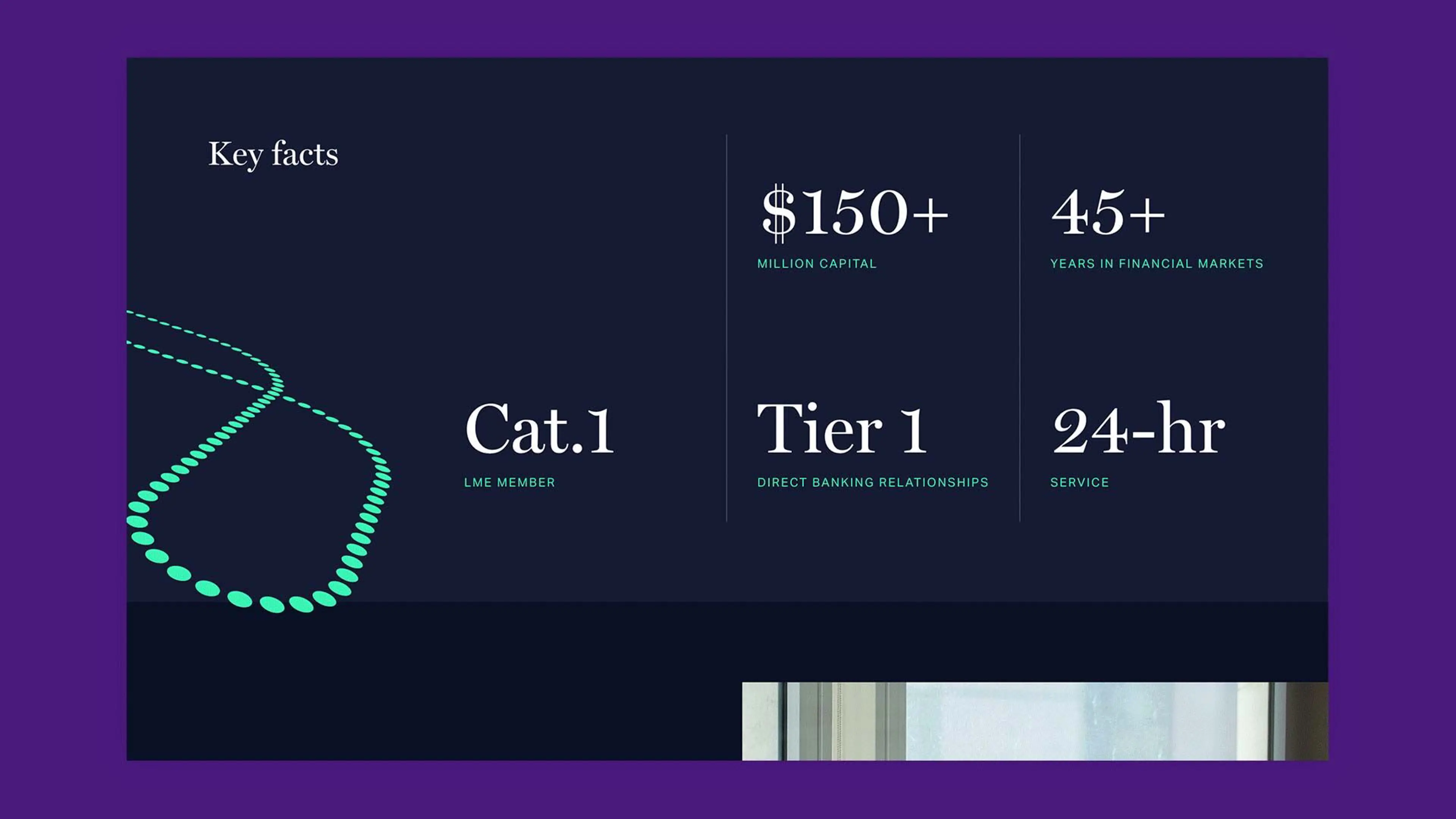
With a strong and trusted reputation in its markets for over 45 years, Sucden Financial could be seen as traditional, mainly transactional and associated with commodities broking.
This did not fit with reality and its ambitions for growth. It needed to build a brand to reflect the breadth of its multi-asset offer, commitment to long-term customer relationships and capabilities to innovate in areas such as fintech.

Measuring impact
In the 24 months since launch, the new website has seen significant improvements.
Highlights
+
25
%
Increase in page views
2
minute
Average engagement time
2.5
page views
Above average per visit.
+
19
%
Increase in active users
32.4
%
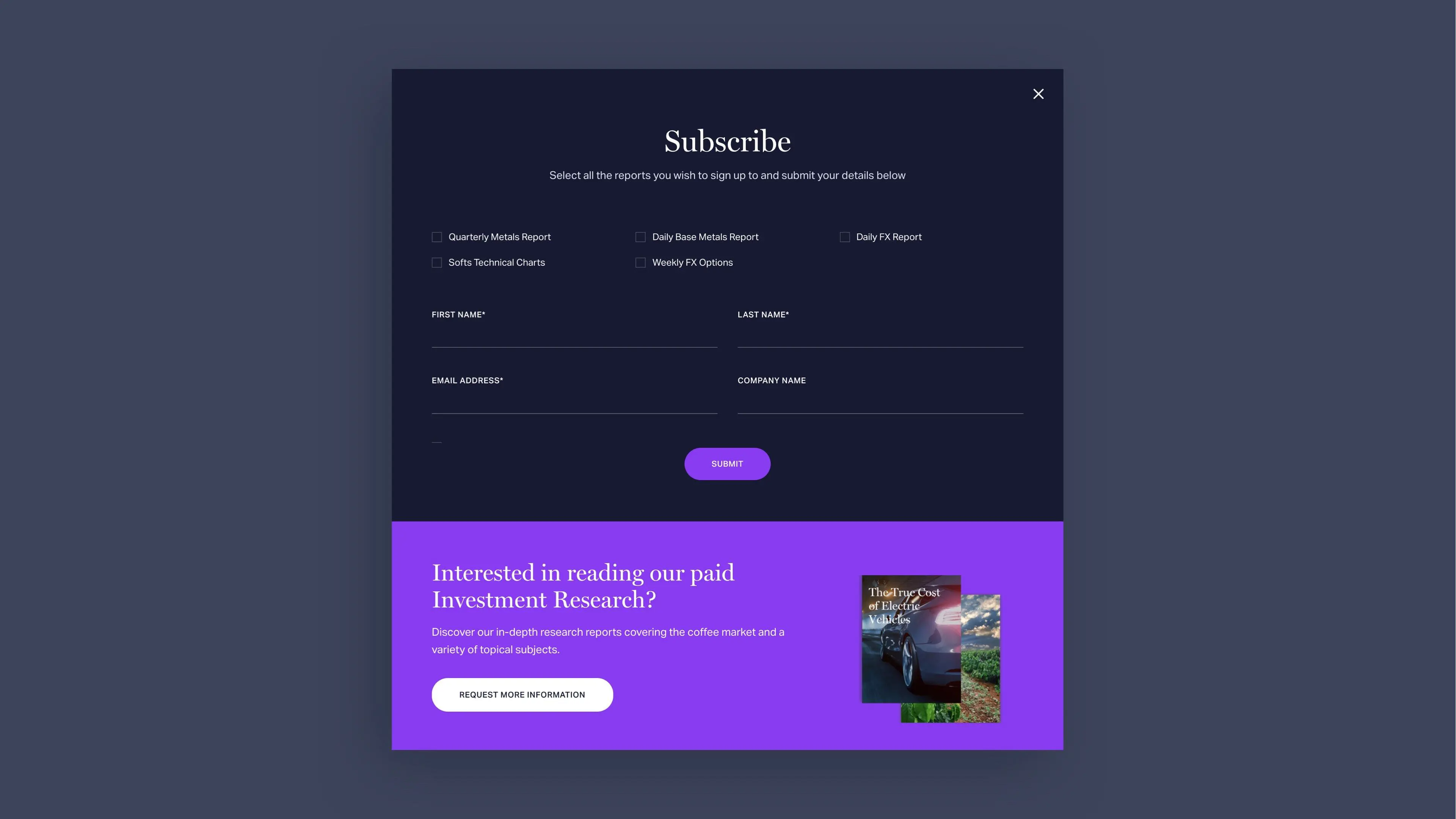
Of users view the Market insights section
19.8
%
Of users who viewed the Market insights section subscribed to the reports
A clear corporate positioning
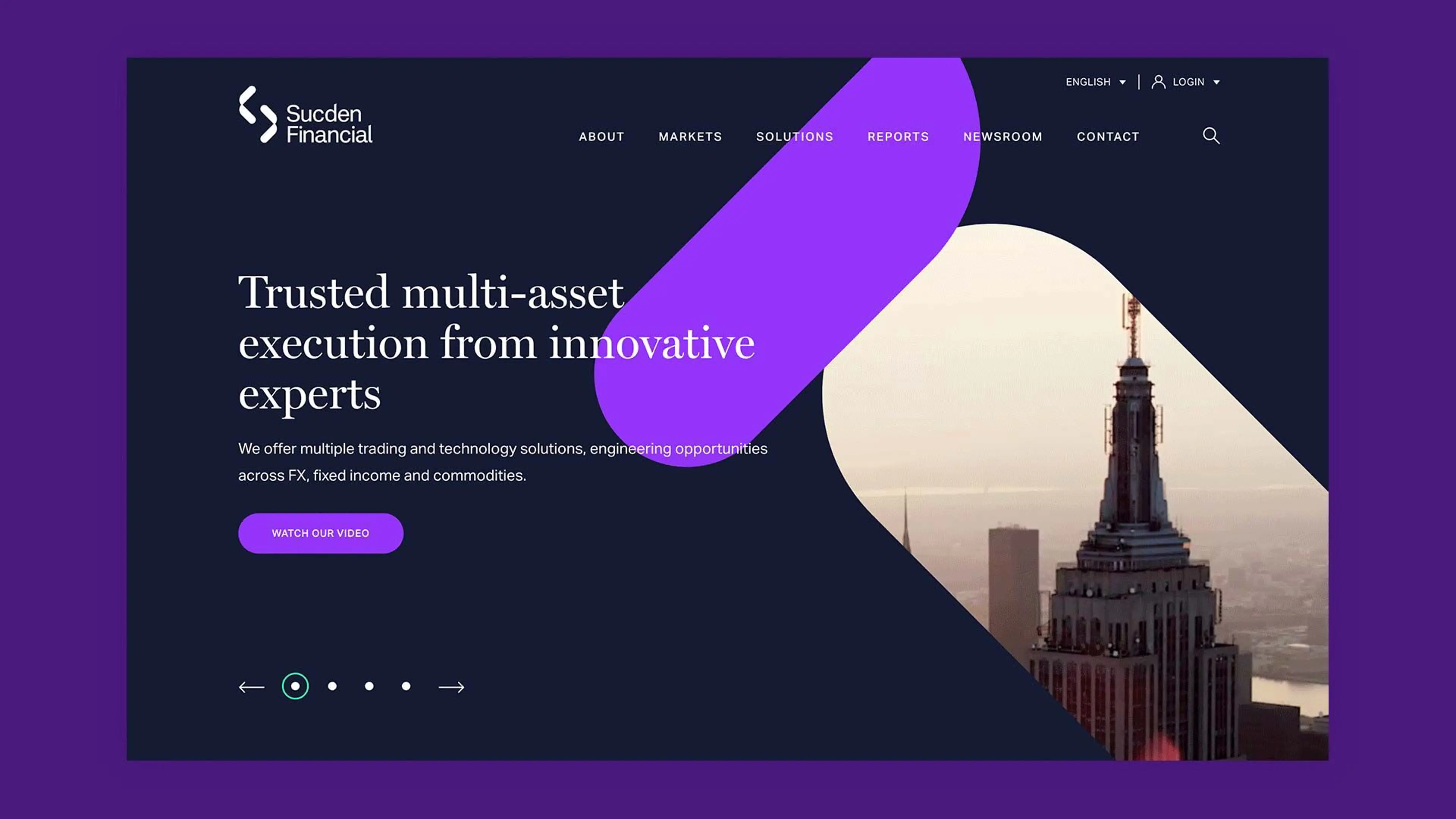
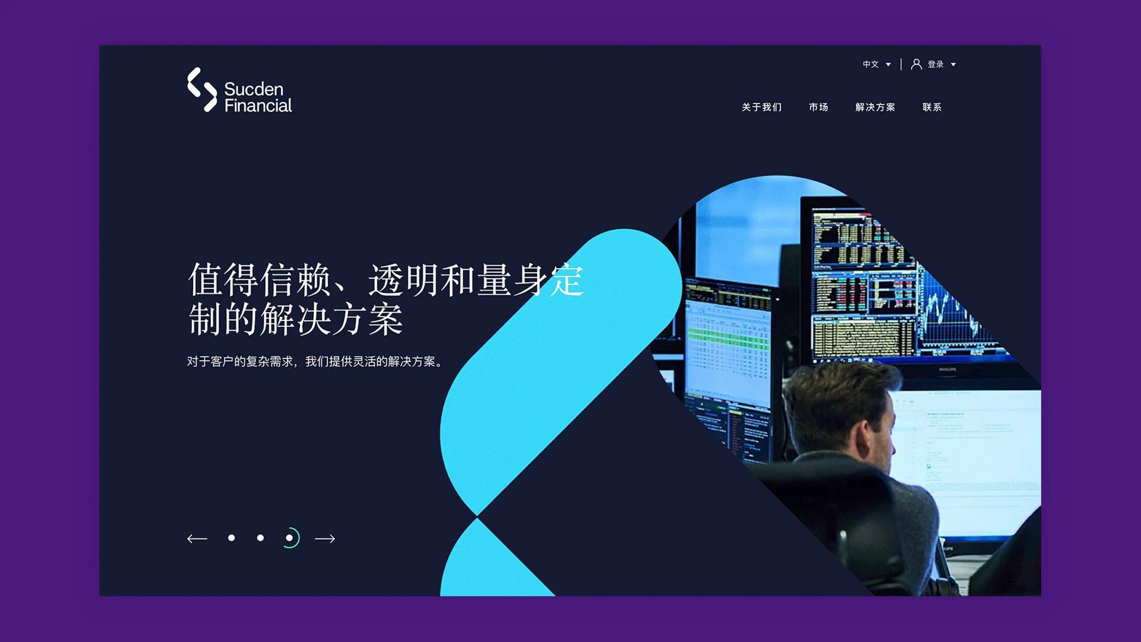
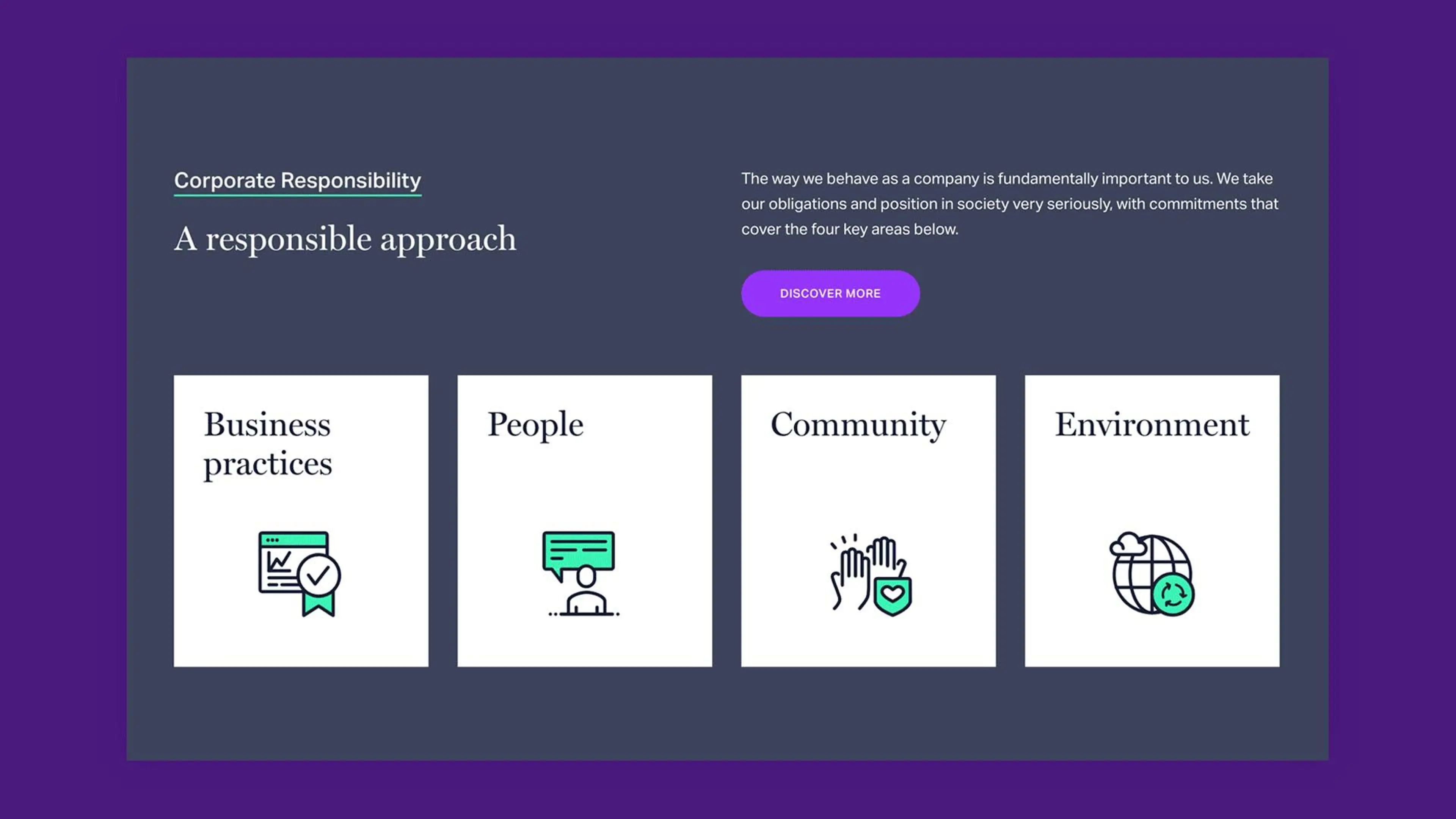
We developed a clear corporate positioning that would build its profile and support the value propositions of its ‘desks’ in individual markets. This involved us developing a brand strategy and vision, and then applying it to a significant brand refresh and overhaul of its website and digital communications.
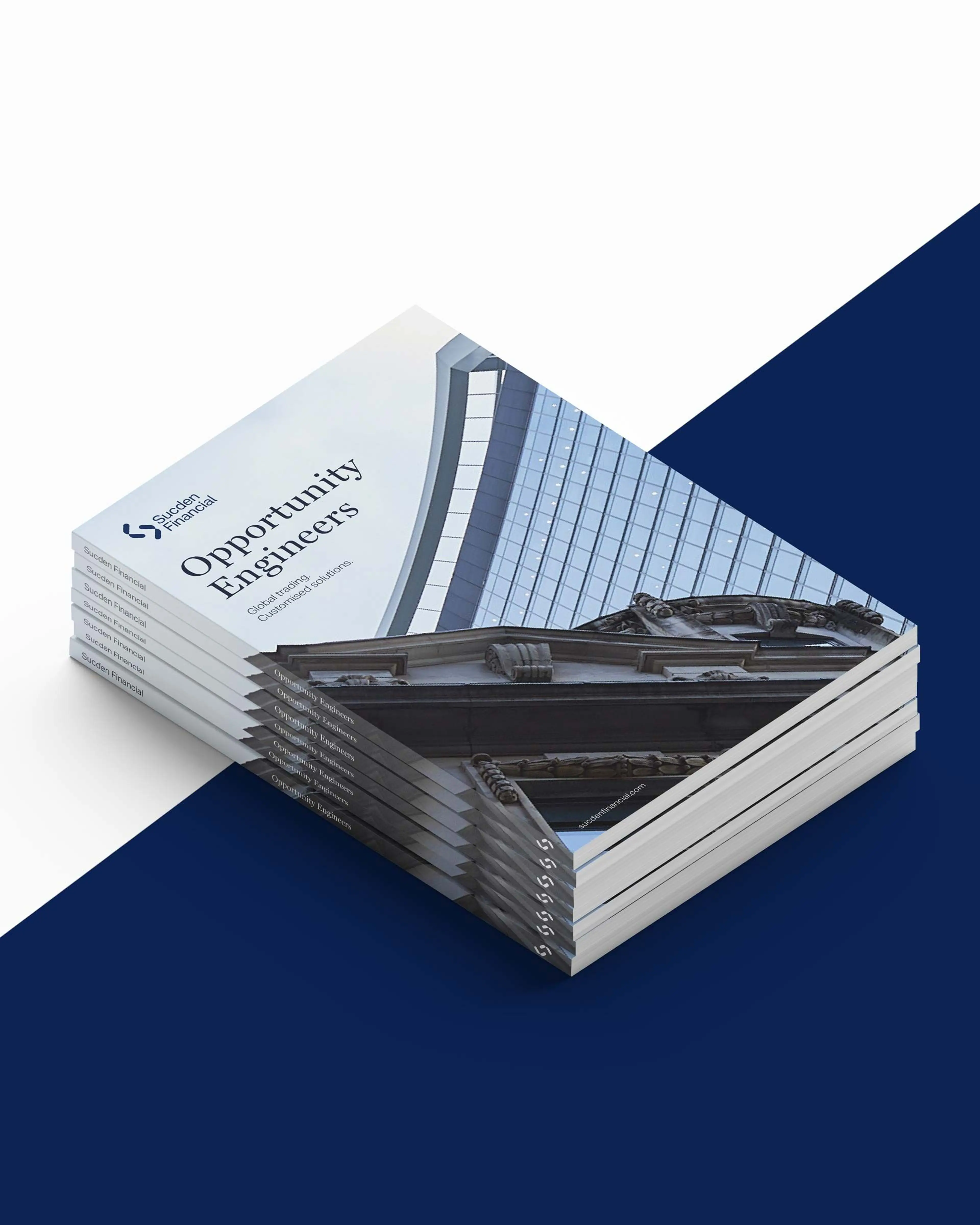
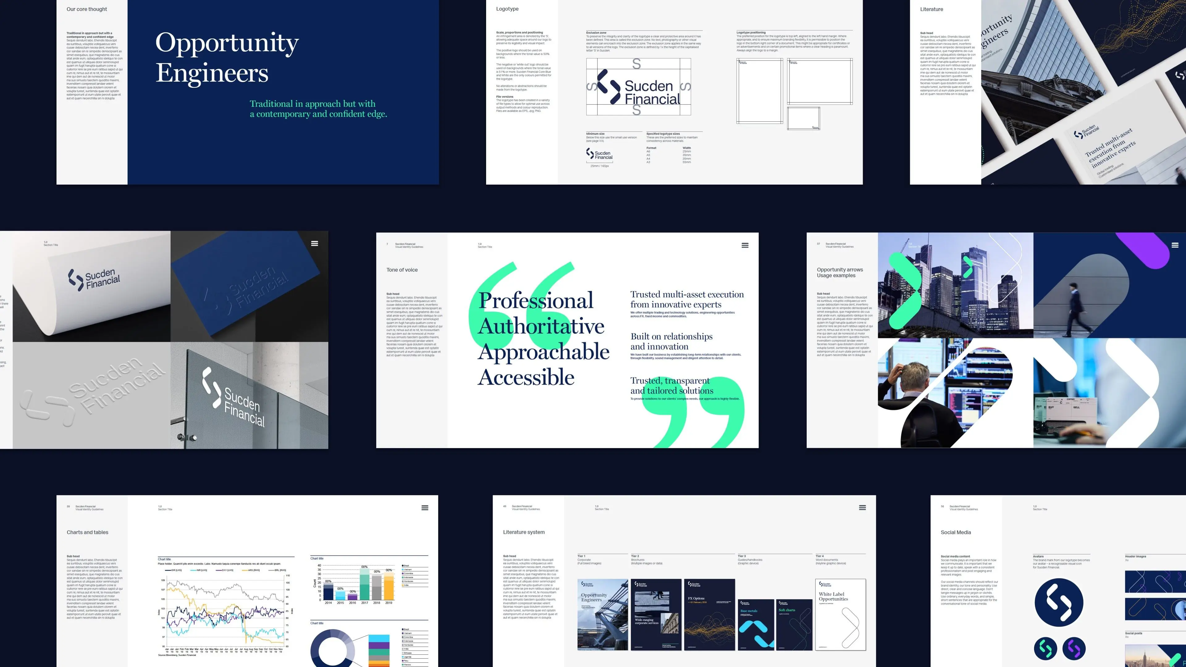
We started working with Sucden Financial's leadership team to create a brand platform, defining what the business stands for, its differentiators and its vision. The output of this was distilled into the idea of ‘Opportunity Engineers’ – the core thought for their positioning and for the creative direction of the brand and digital experience.
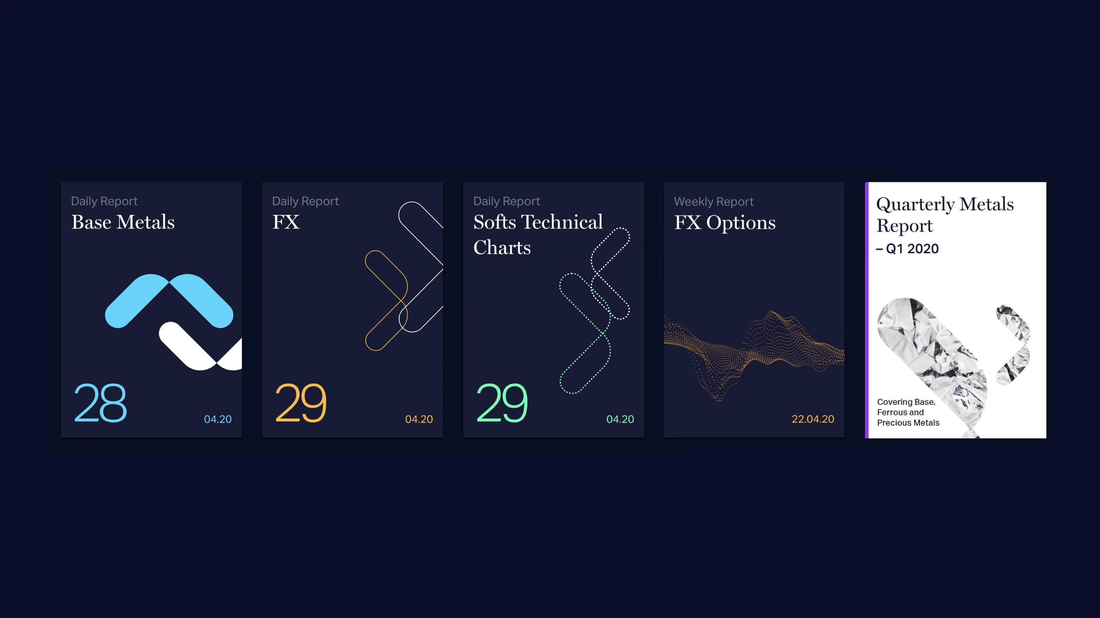
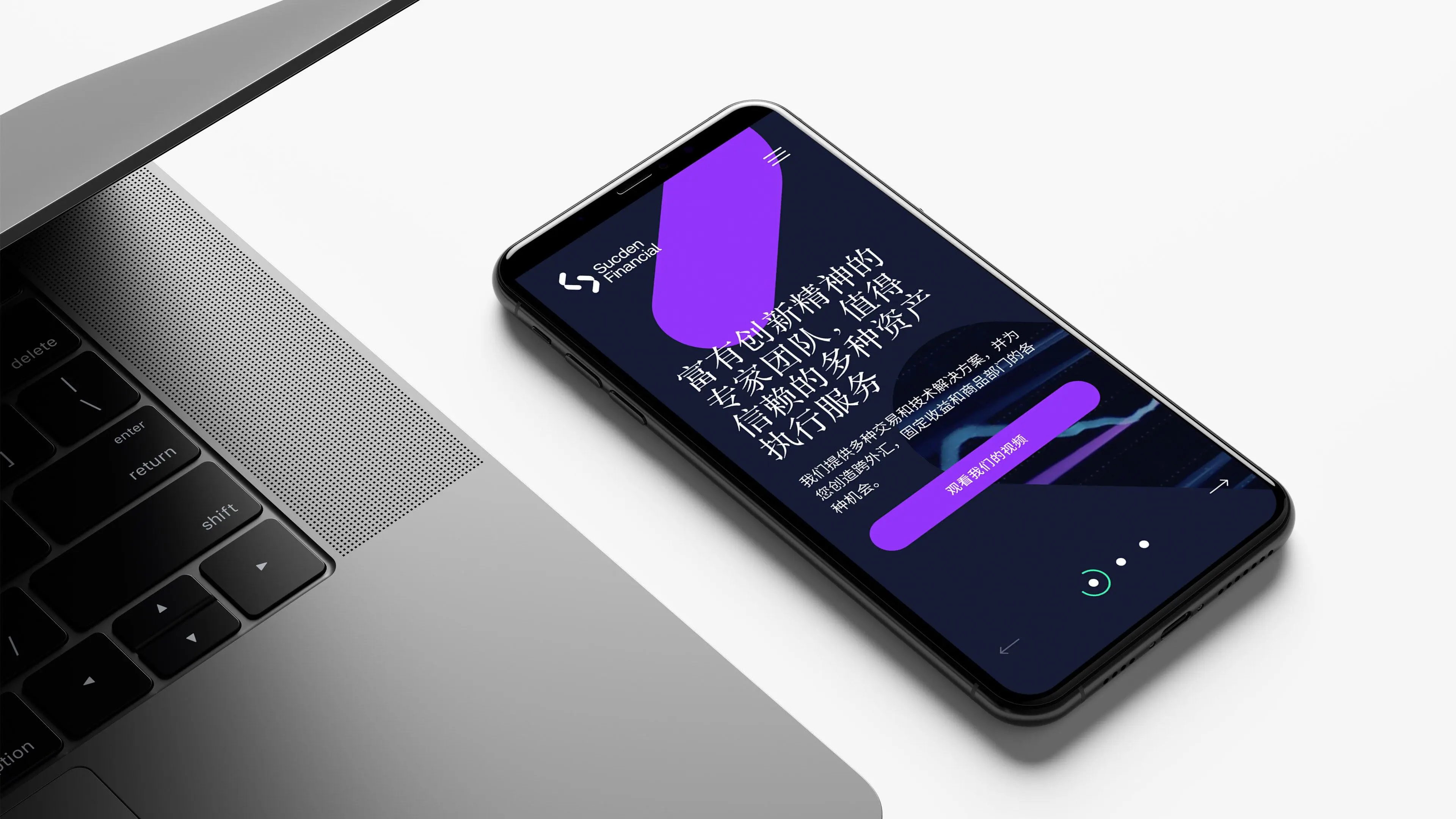
Our assessment of Sucden Financial’s existing brand equity and competitor brands indicated a need for significant change to its visual brand to live up to the new brand strategy and encourage its various audiences to re-evaluate their views of the multi-asset provider.
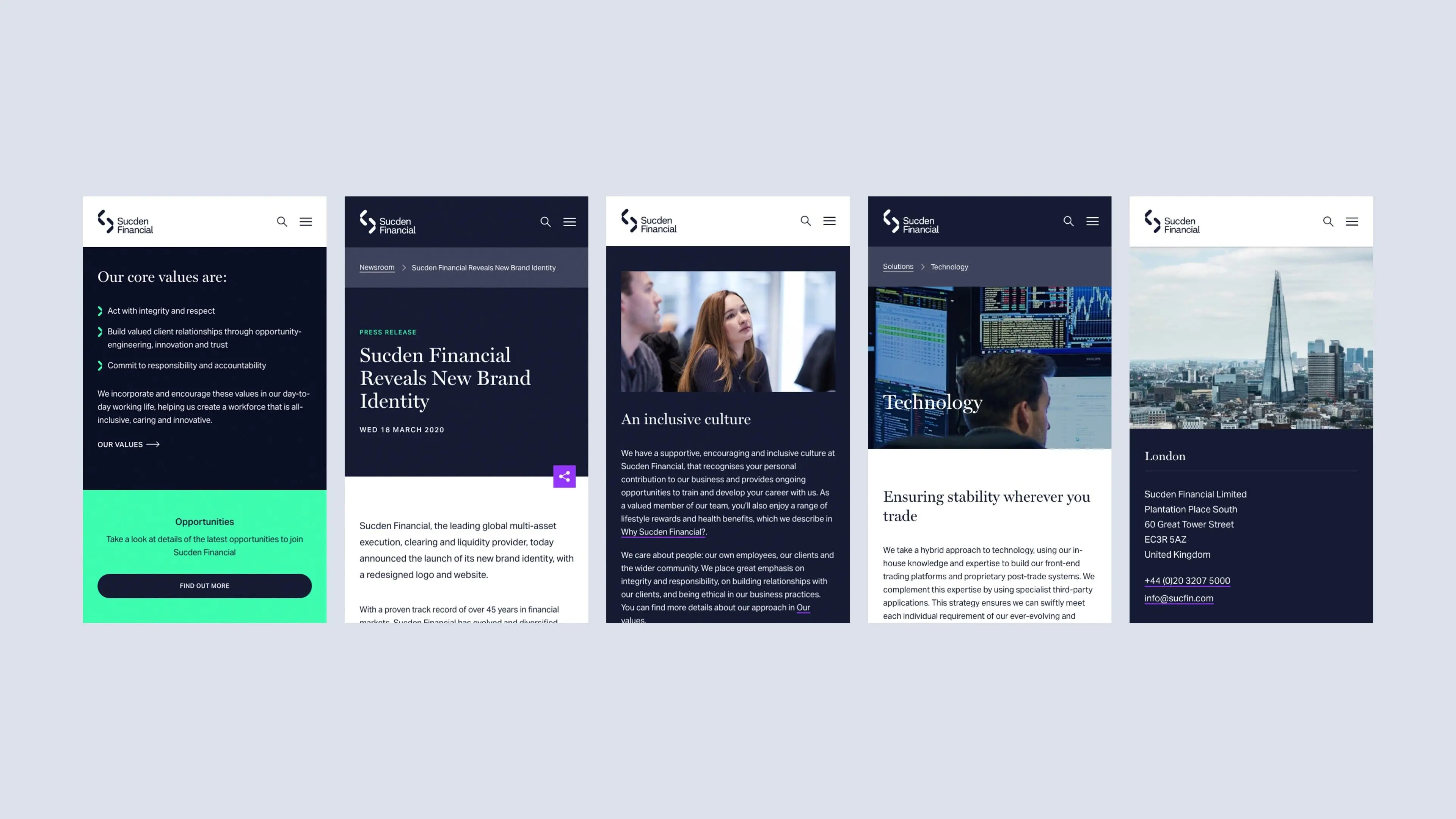
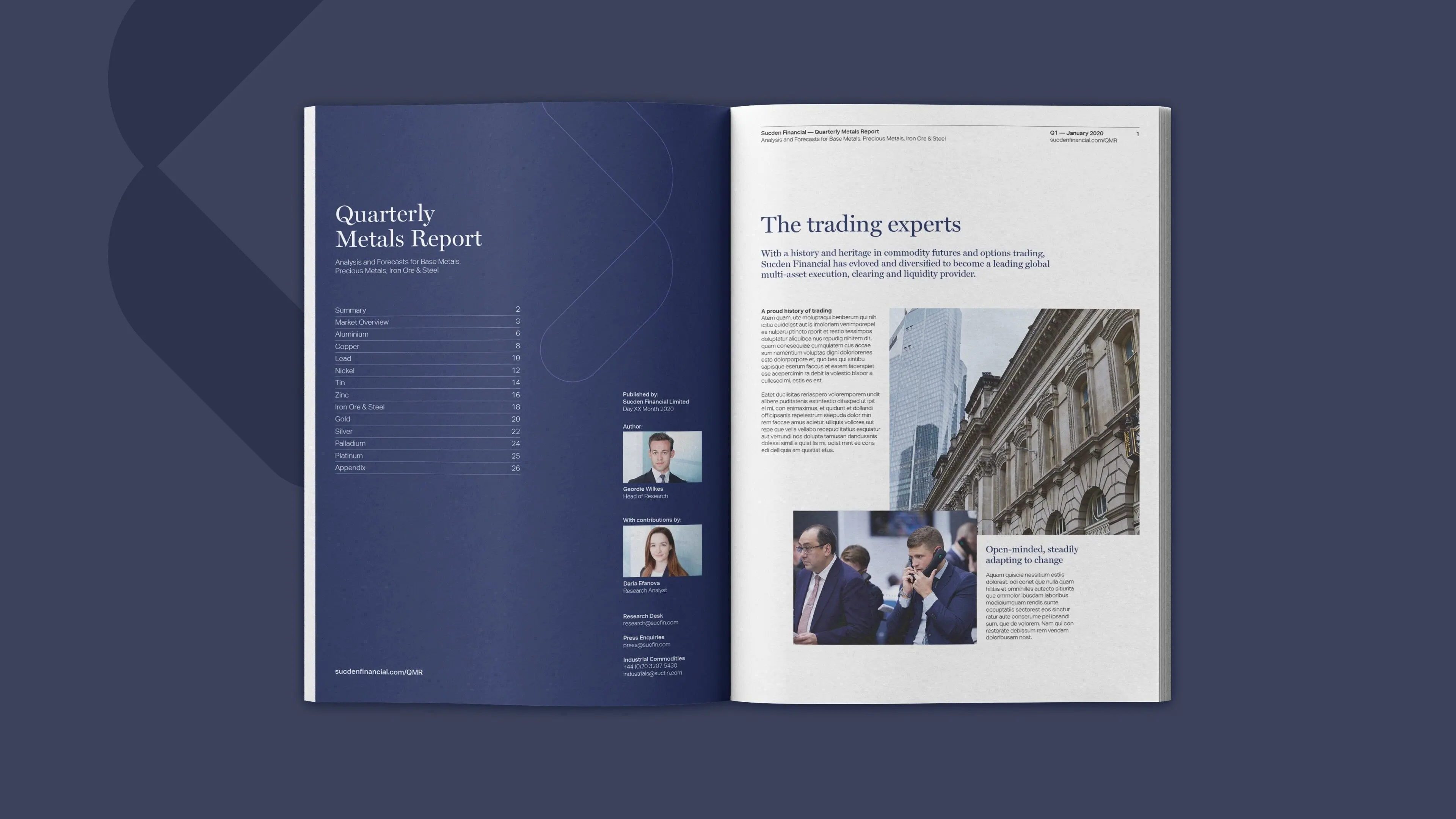
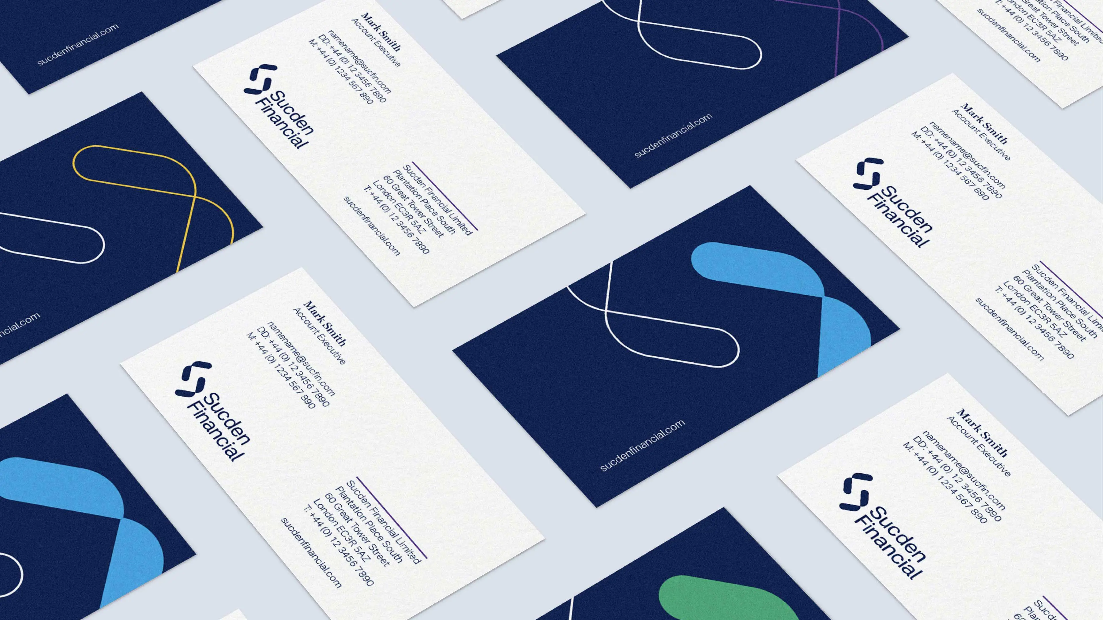
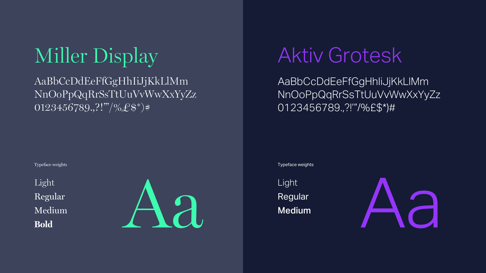
We created a new wordmark and symbol reflecting ‘Opportunity Engineers’ and a refreshed look and feel. In turn, the refreshed brand (mark, symbol, visual style, brand story and tone of voice) was applied to digital channels, print, environment and internal communications, including EVP, values and recruitment proposition.



The website development included the planning and build of an integrated online reports and email campaign platform, which was successfully launched in conjunction with the brand internally and externally to maximise impact.