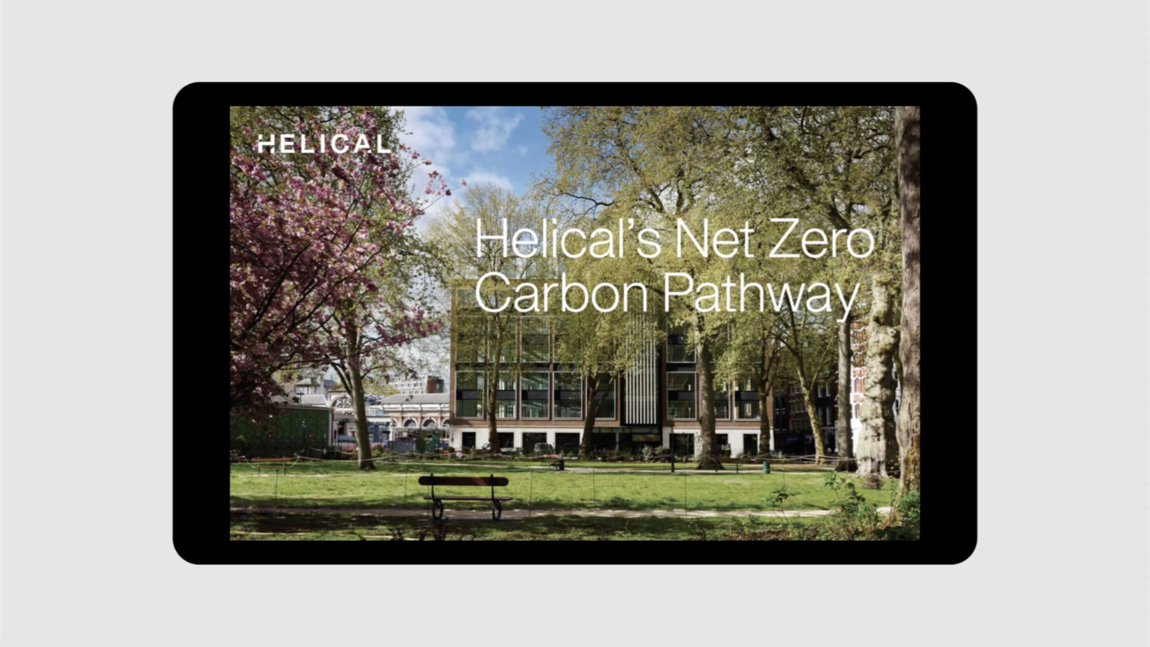
Rebranding one of London’s most sustainable development companies
With a market-leading reputation as one of London’s most respected real estate investment trusts, Helical has been at the forefront of property development and investment since the mid-1980s.
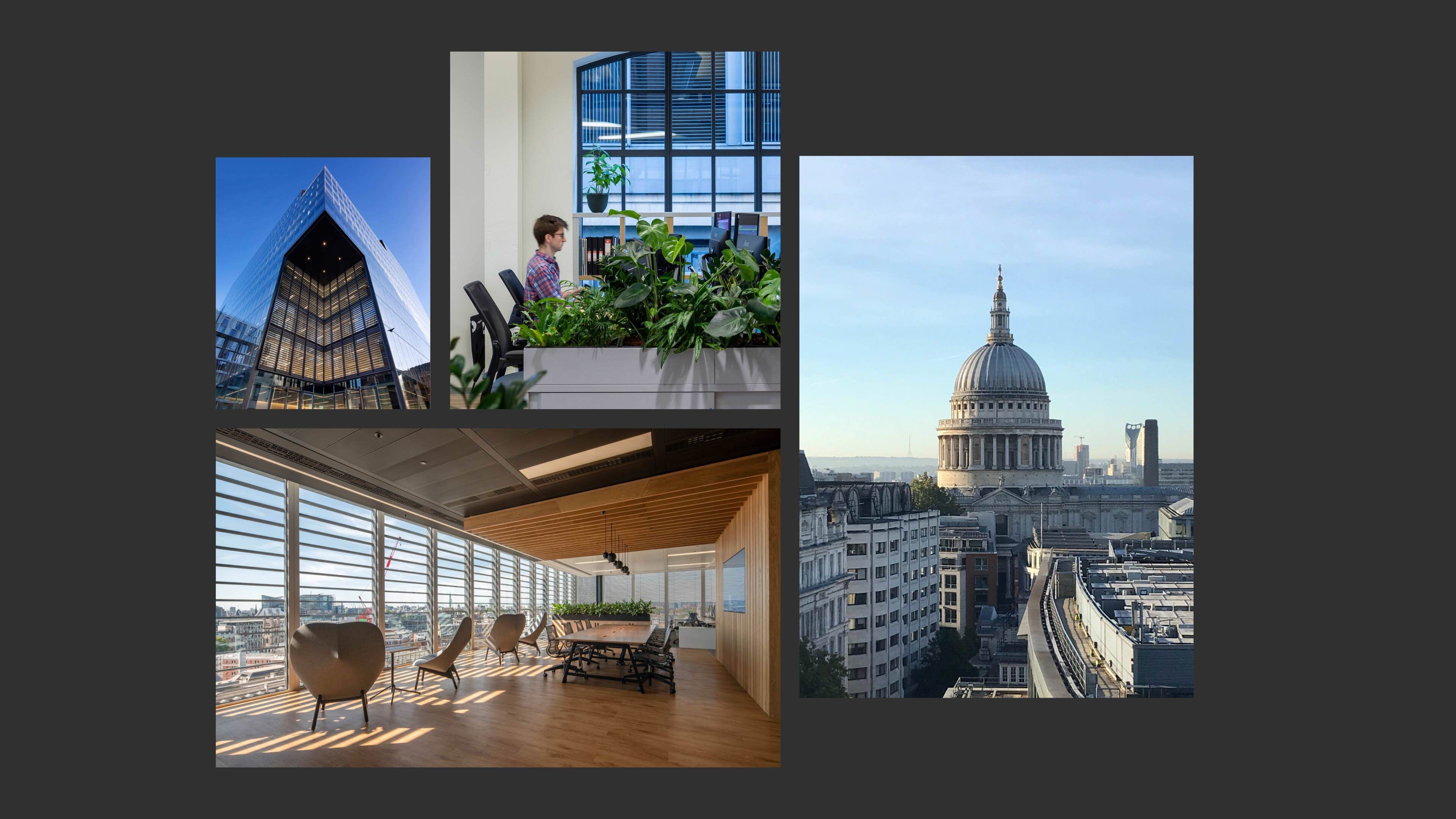
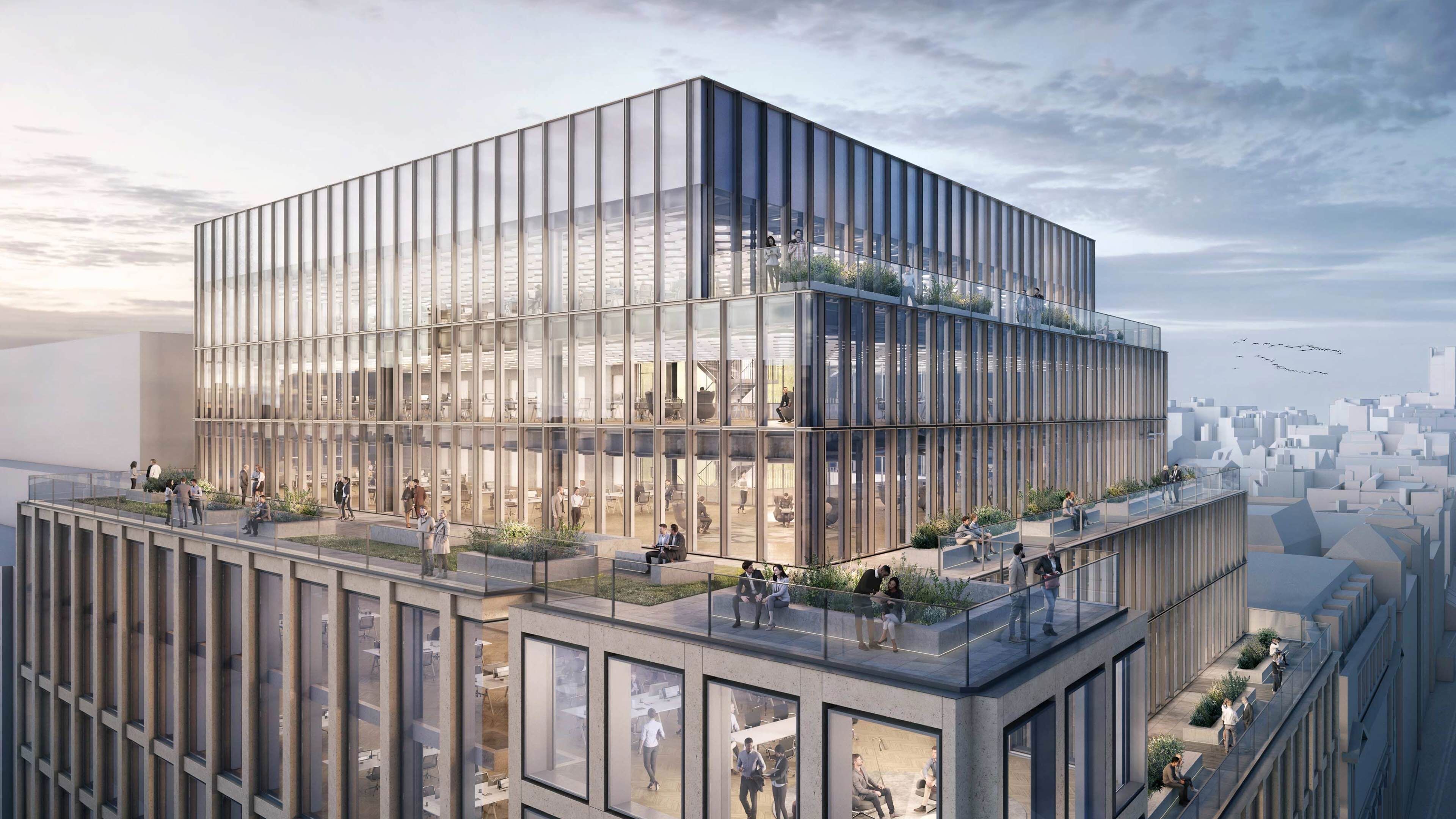
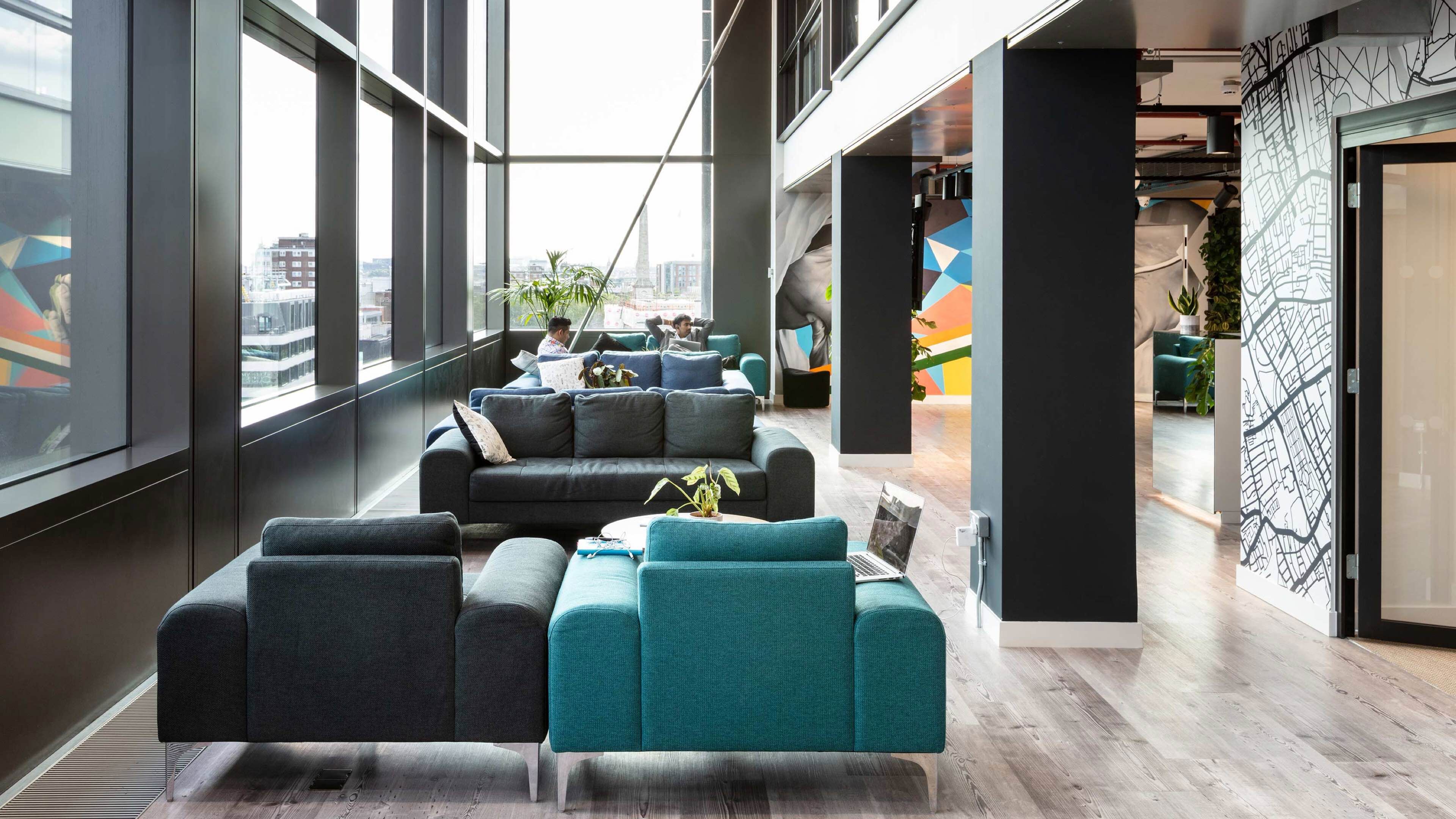
With a vision and commitment to put sustainability at the heart of the company, Helical has invested time and energy to become a truly purpose-led business, creating inspiring and sustainable spaces for occupiers to thrive and communities to flourish, with workplaces that are technologically smart, rich in amenities and designed to promote employee wellbeing.
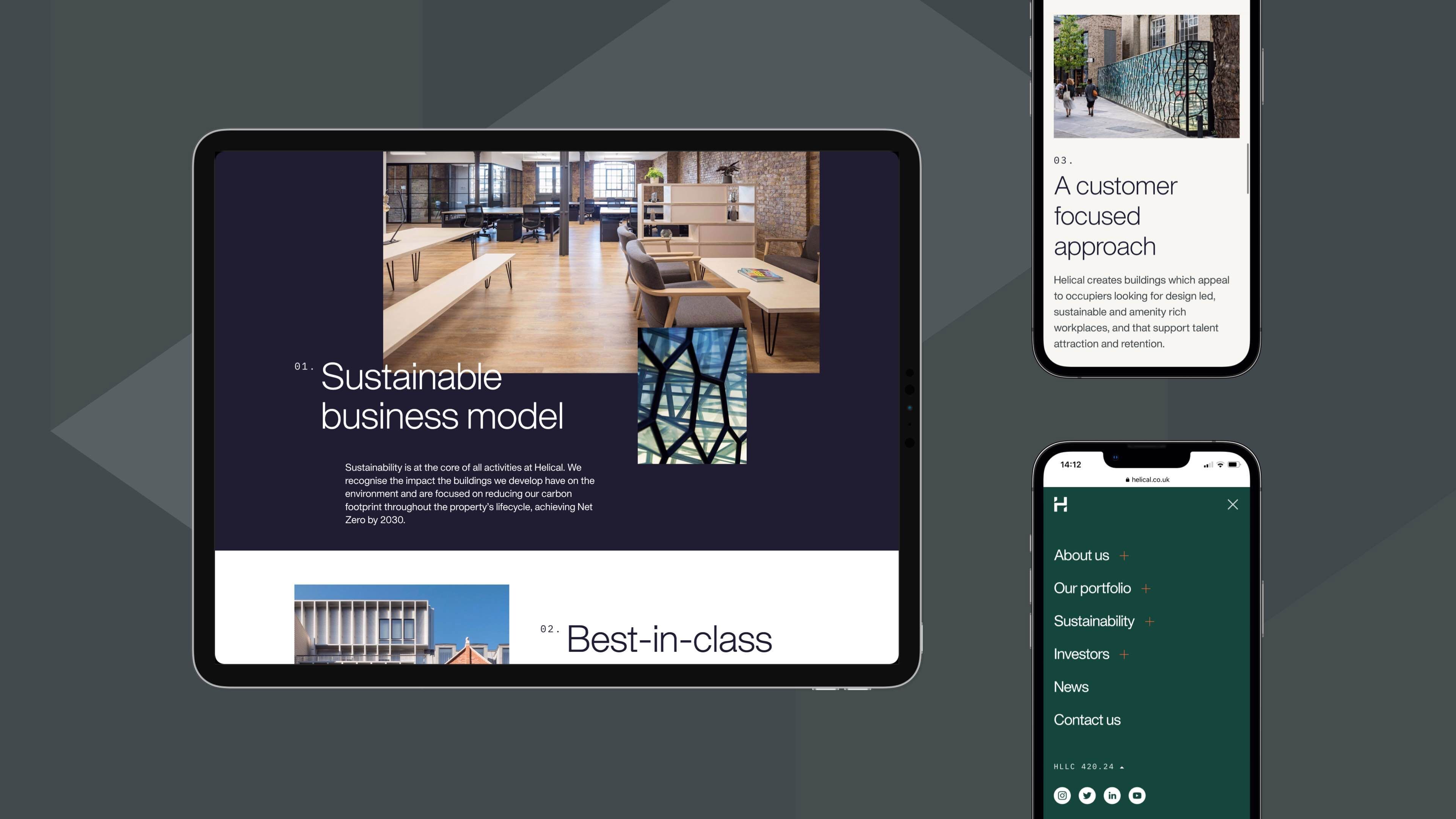
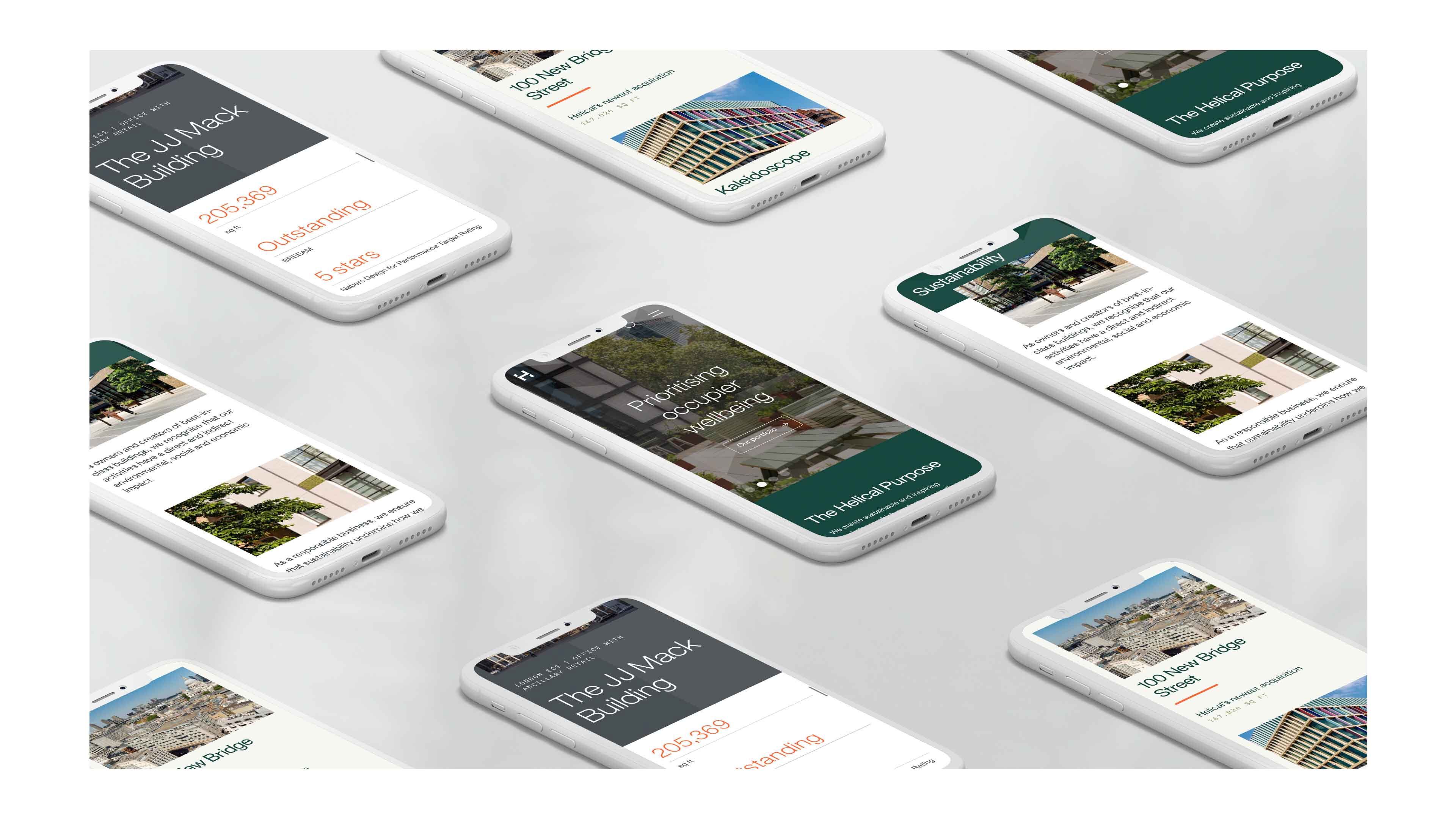
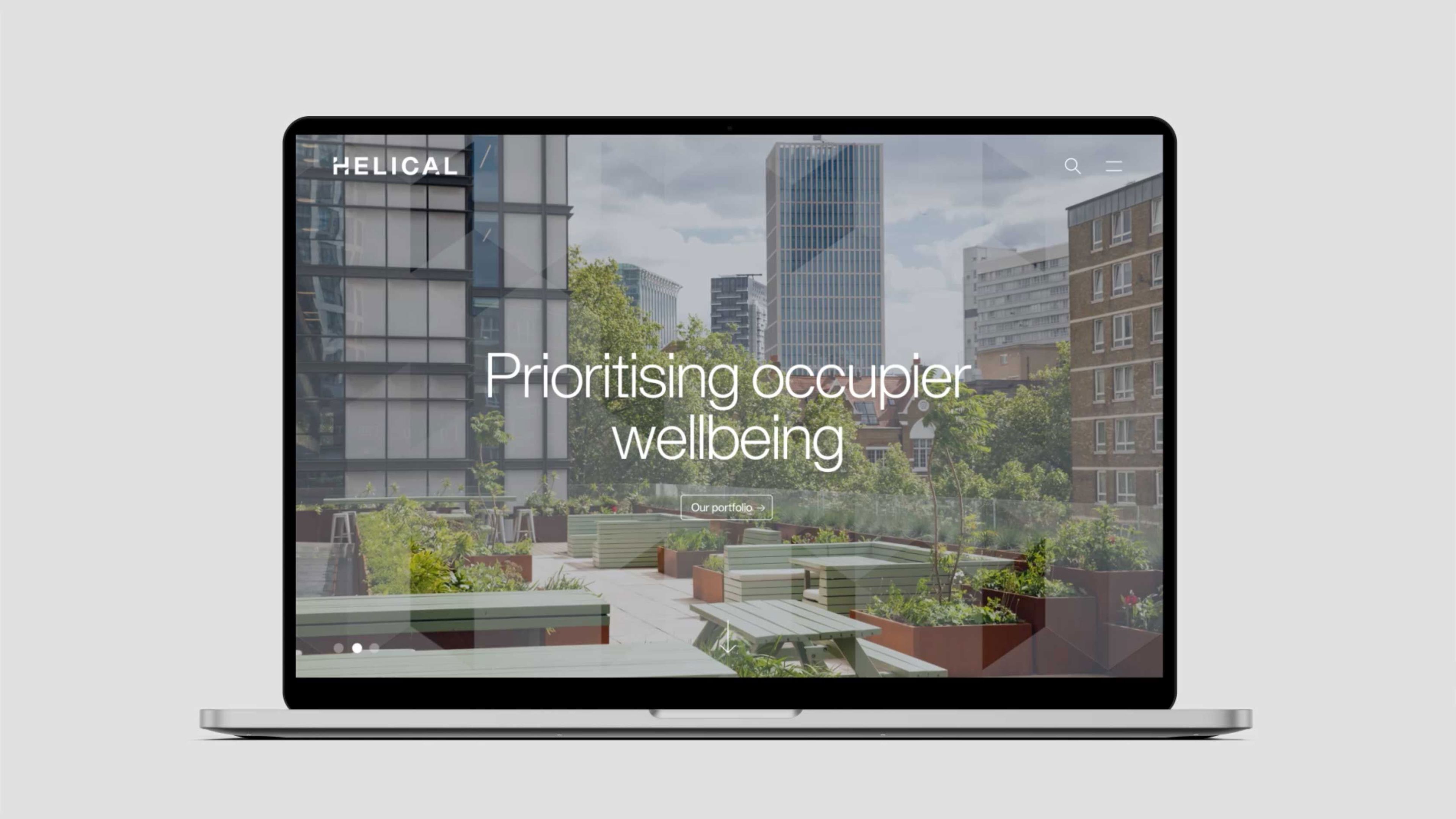
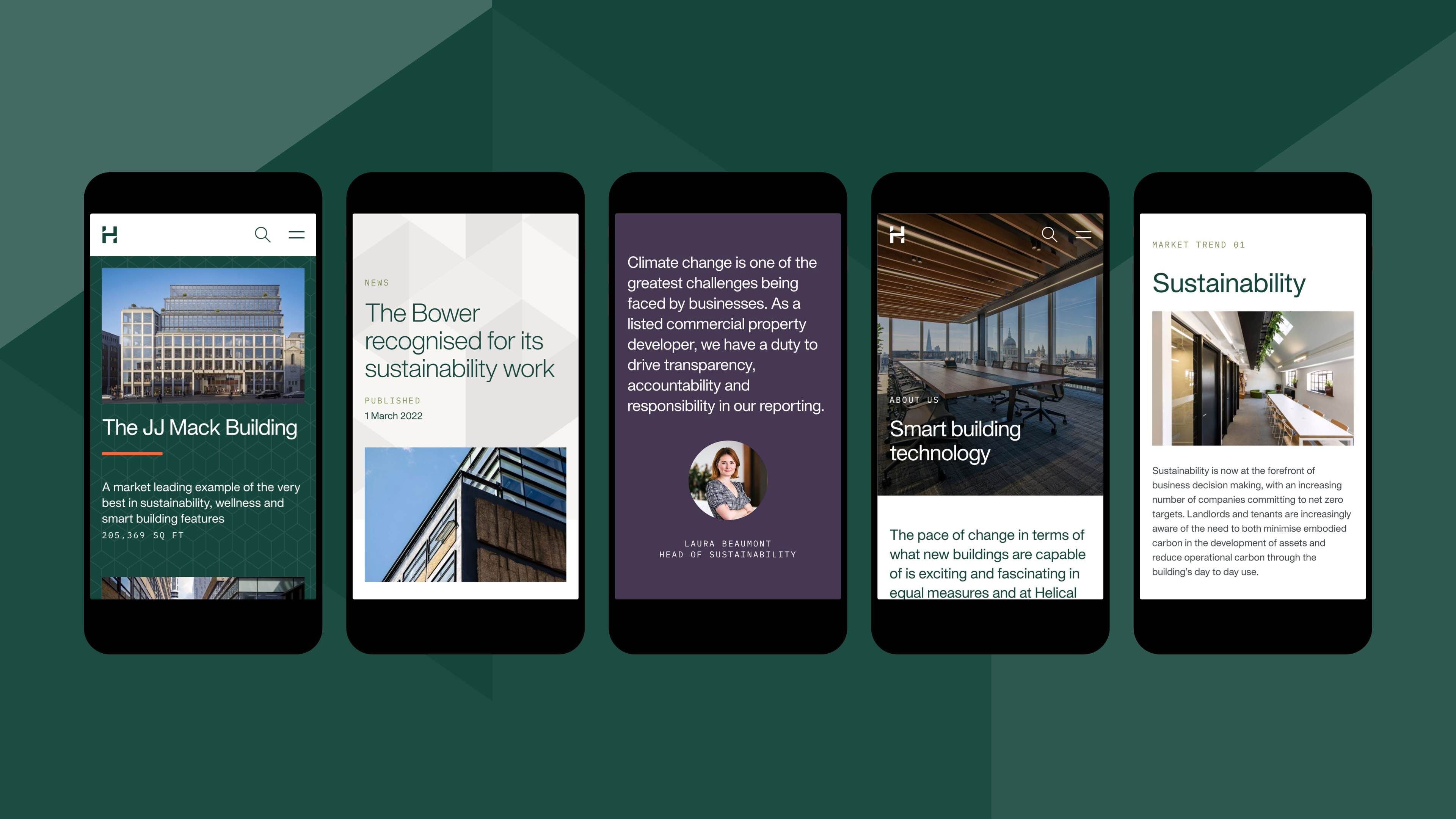
We were commissioned to create a new digital-first brand and website to communicate this benchmark shift in strategy and Helical’s future-focused outlook, ensuring its purpose, sustainability commitments and vision for inspiring workplaces are clearly expressed to investors, occupiers and the wider community.
Measuring impact
In the 18 months since launch, the new website has seen significant improvements.
Highlights
+
32
%
Increase in traffic (site visits)
69
%
Engagement rate
3
Page views (above typical B2B page views per visit)
25
%
Of visitors download a document
+
20
%
Improvement in SERP ranking year-on-year
A new sustainability-focused philosophy
As the business evolved, the brand remained unaltered and lacked alignment to Helical's new sustainability-focused philosophy.
The old visual identity was elegant but had limited visual presence and standout across multiple touchpoints from large format applications to the growing use of multiple digital channels.
An updated visual identity
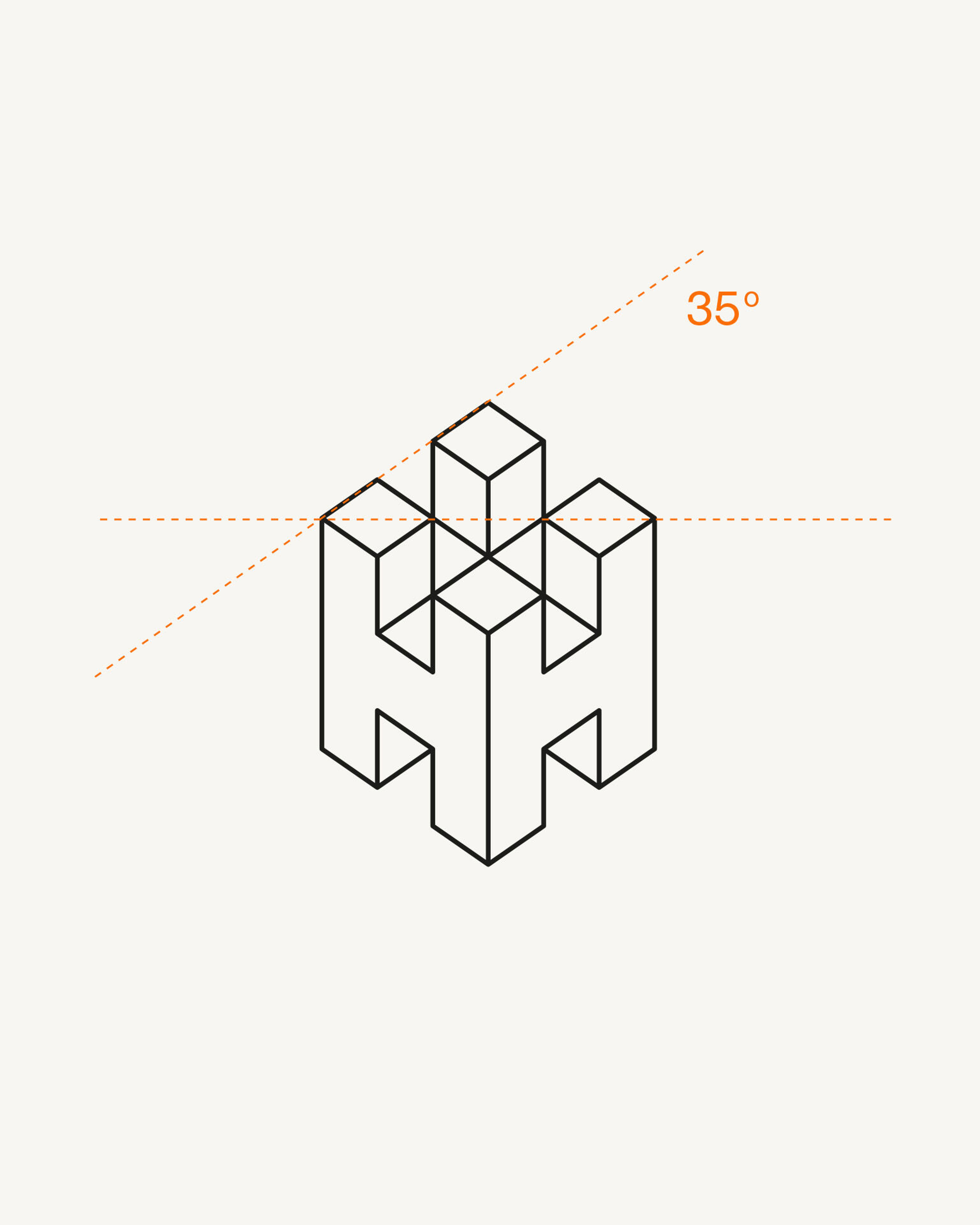
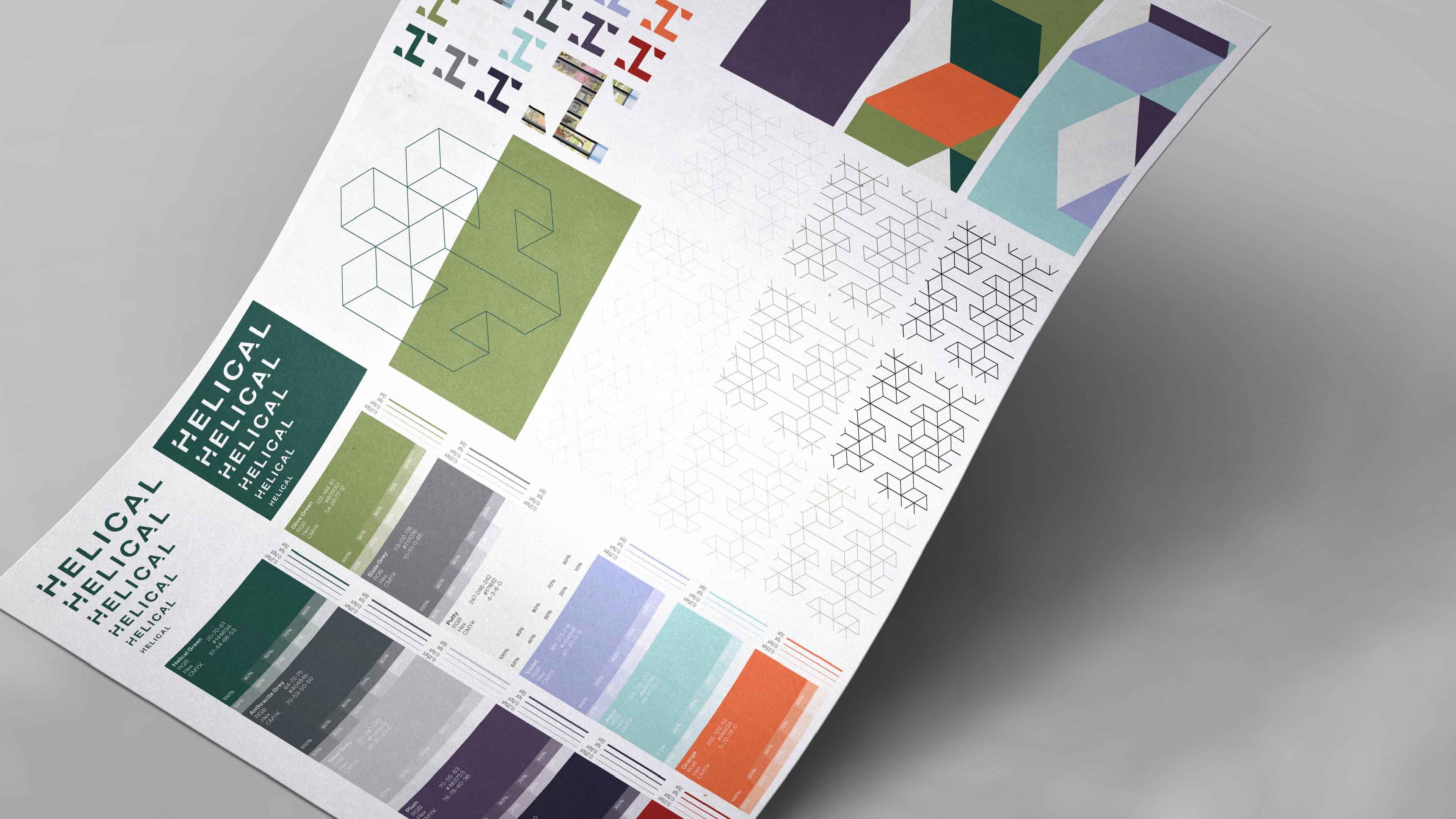
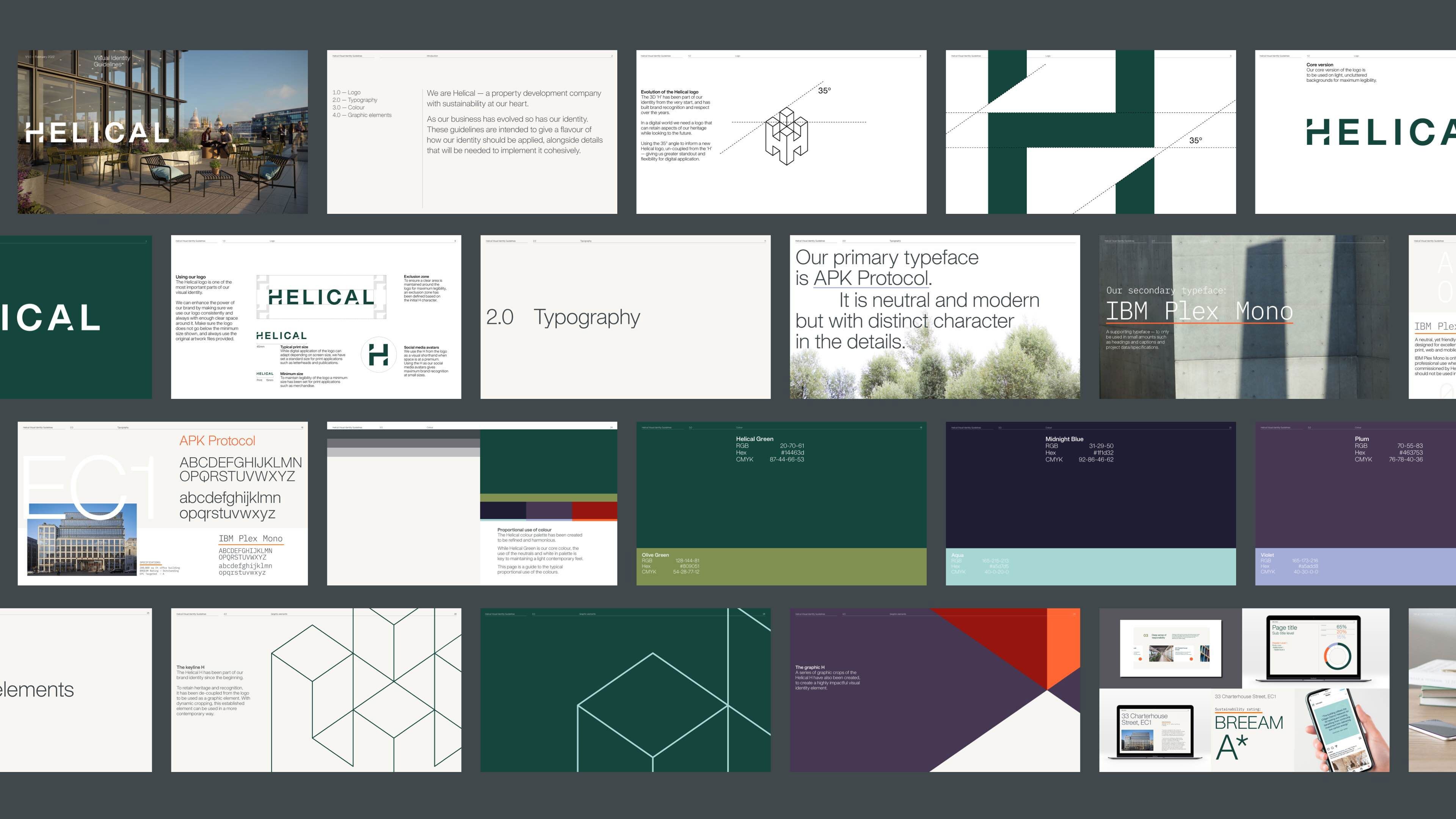
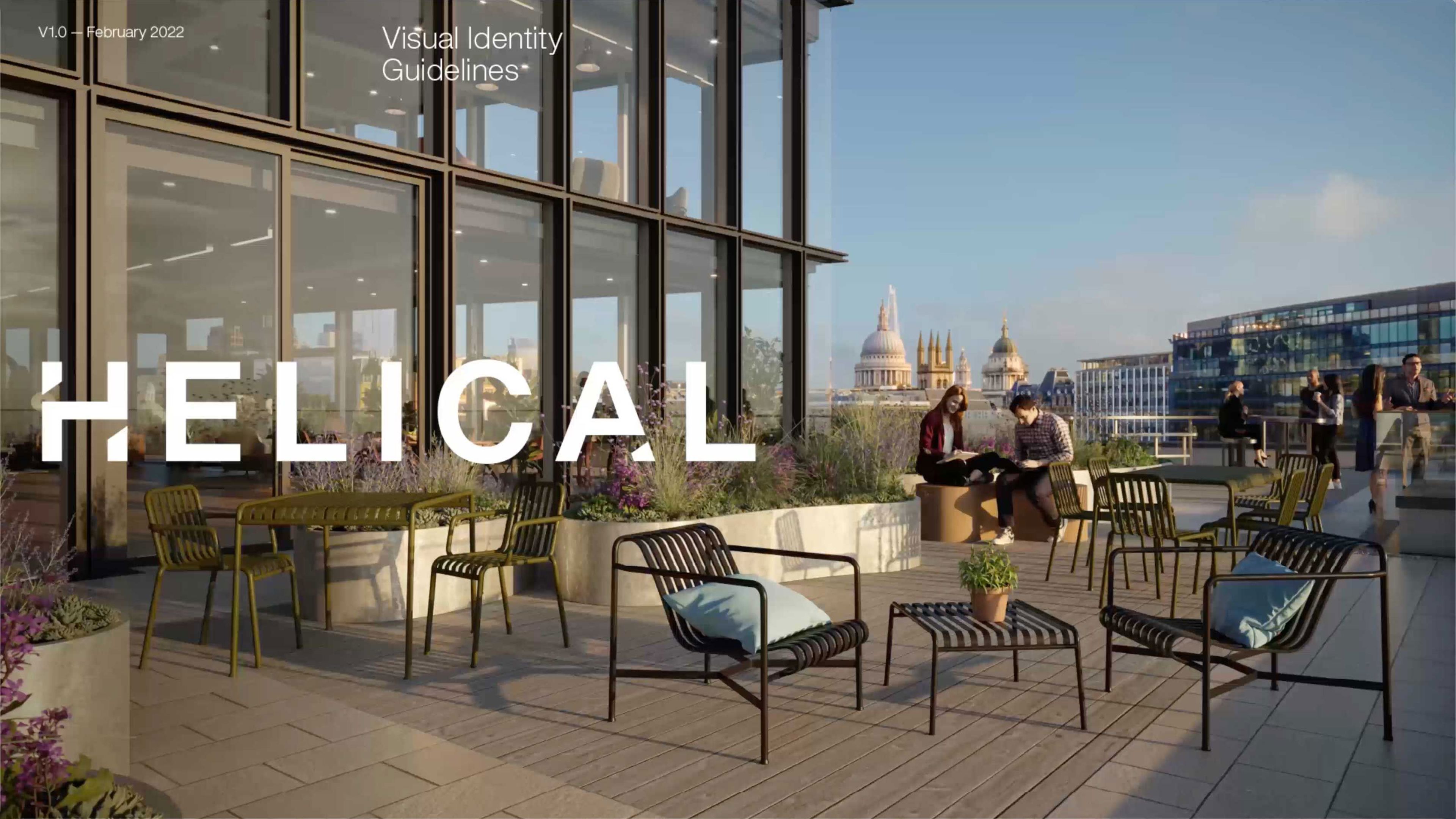
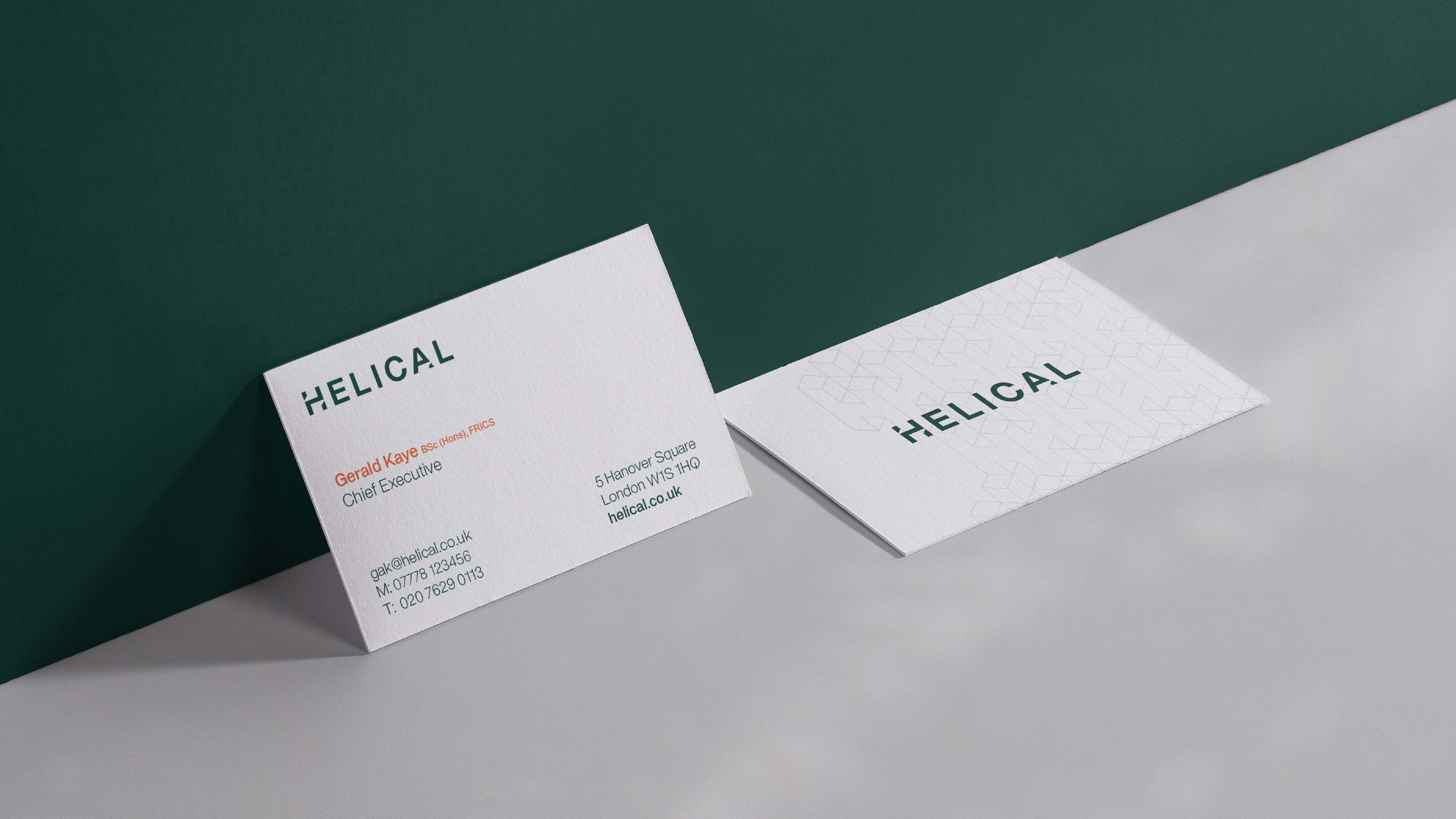
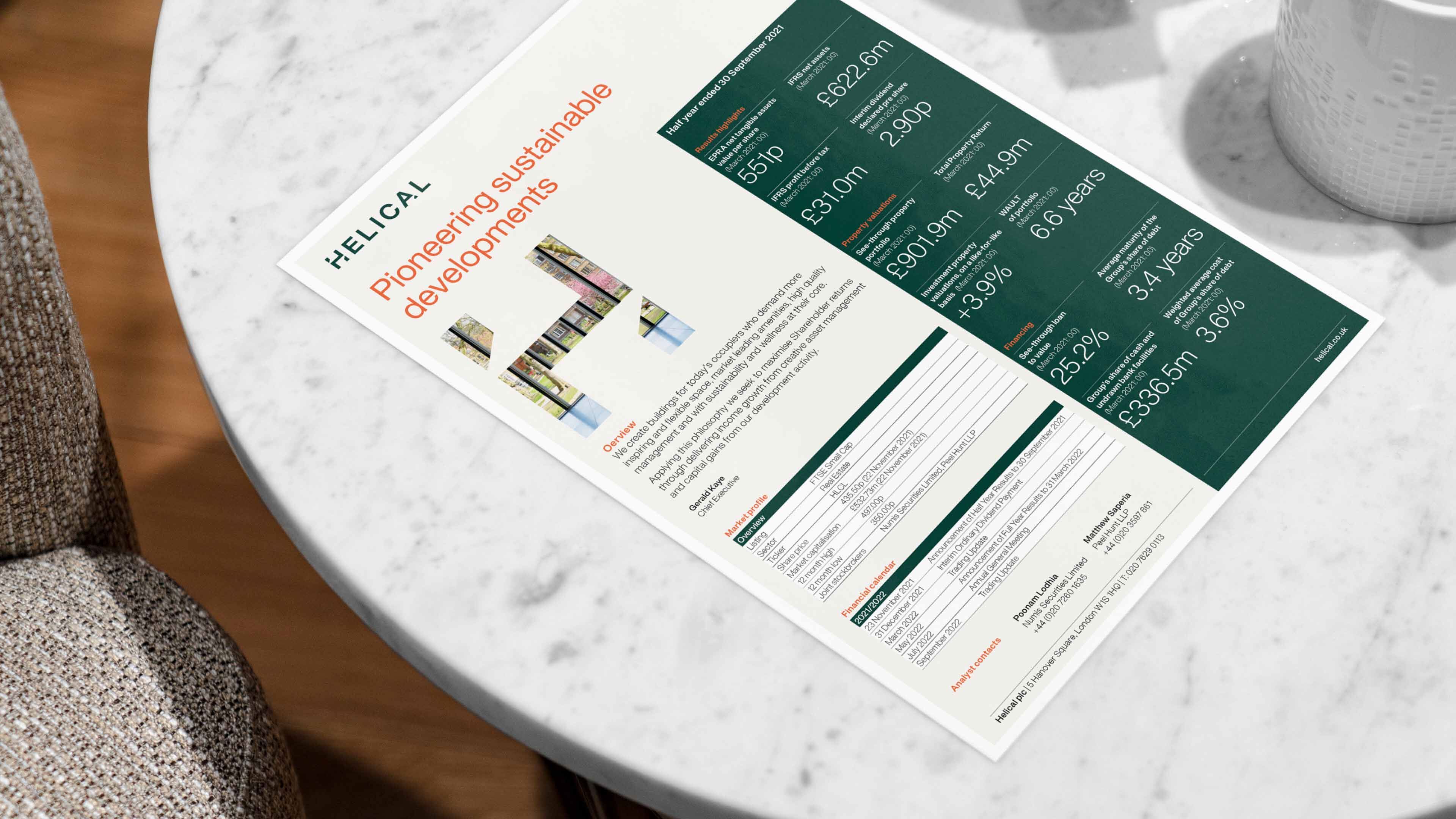
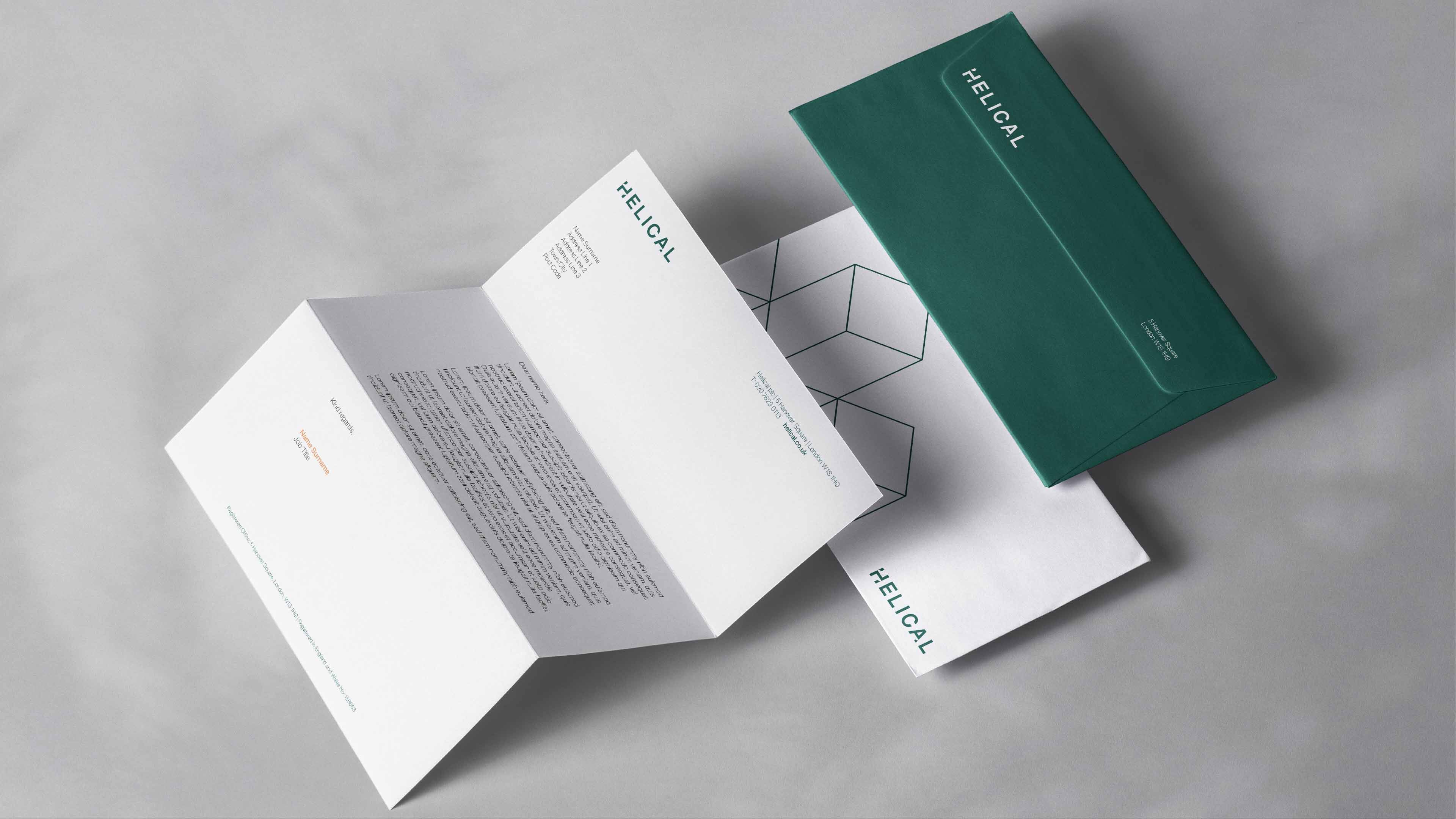
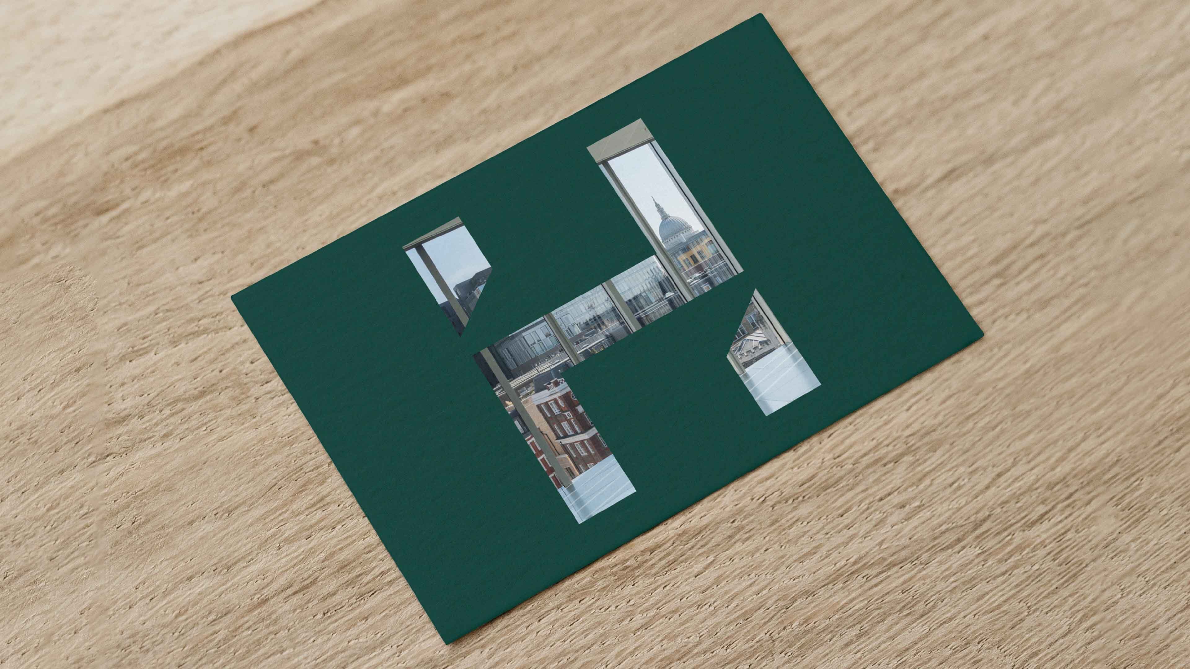
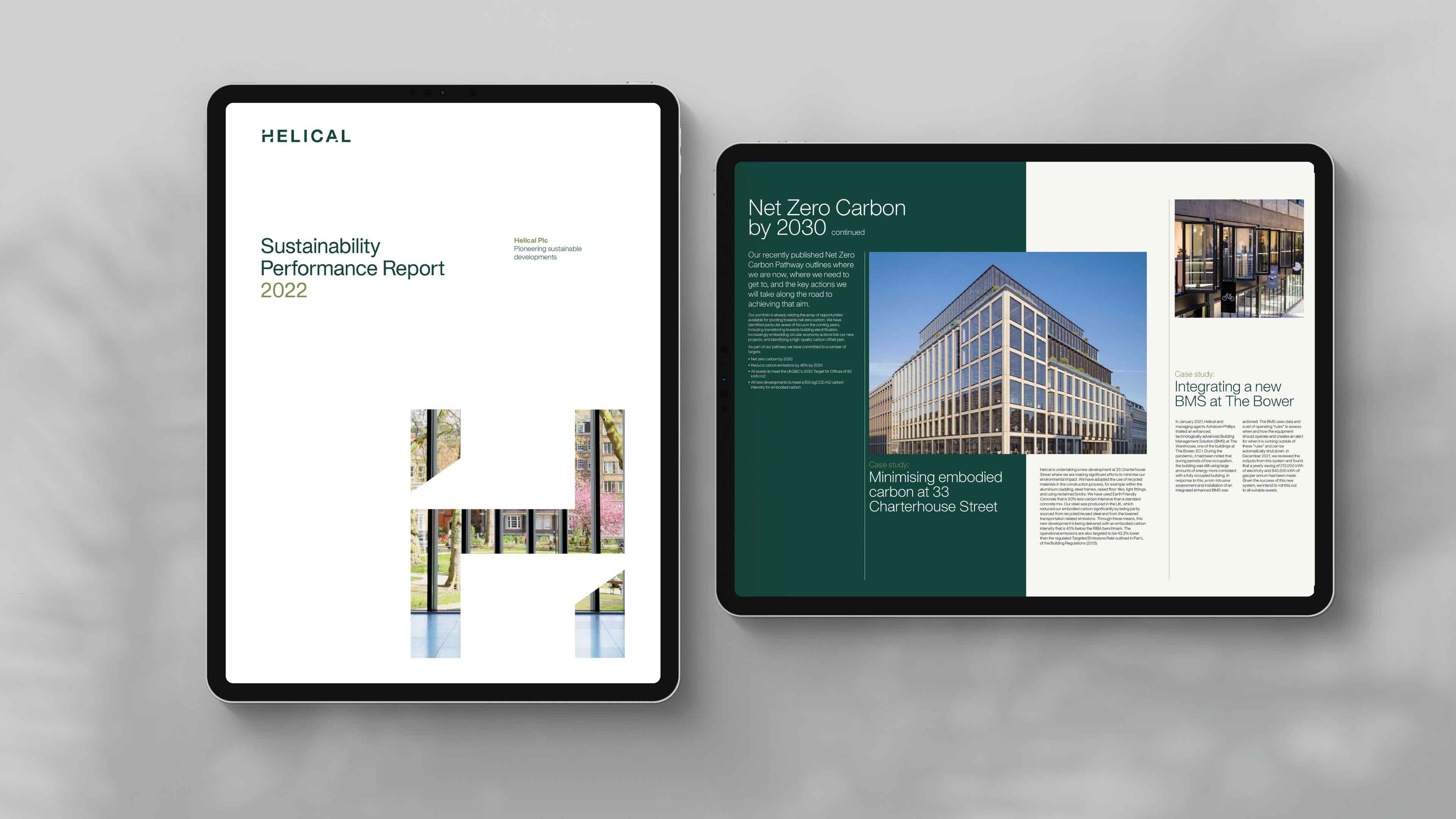
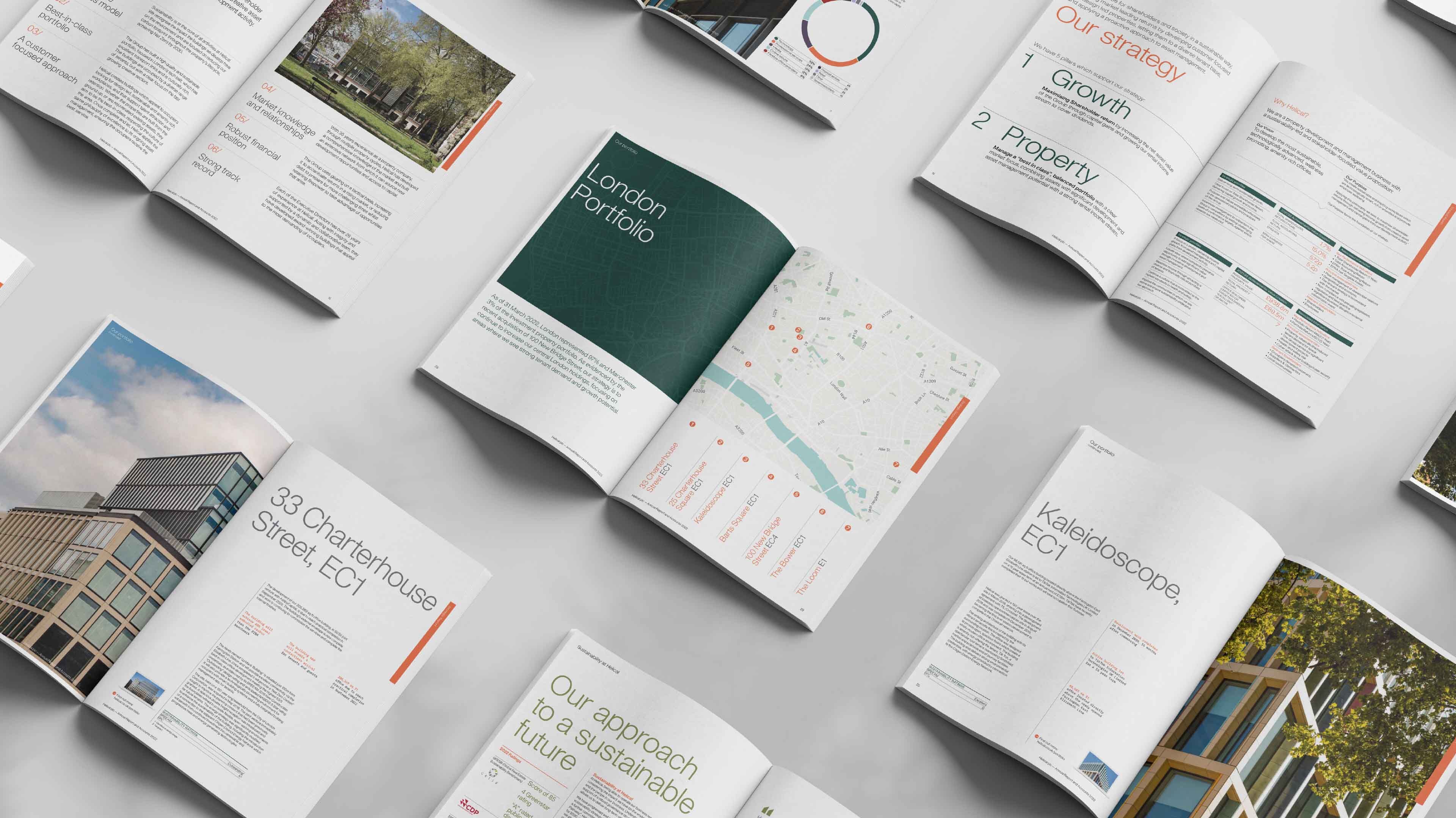
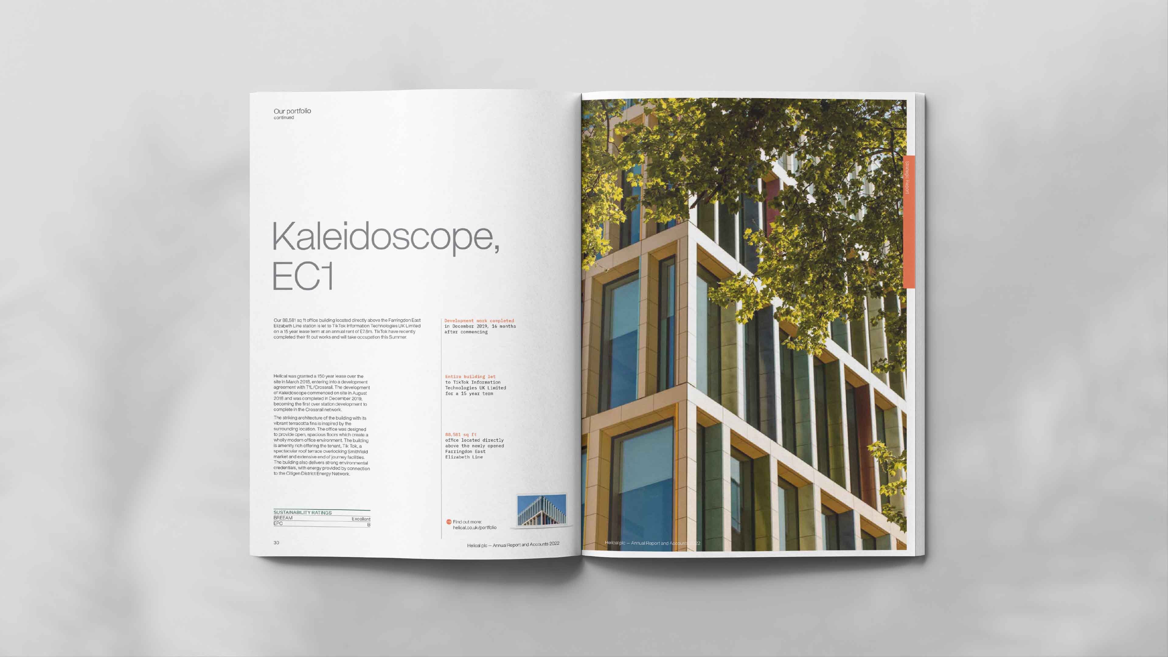
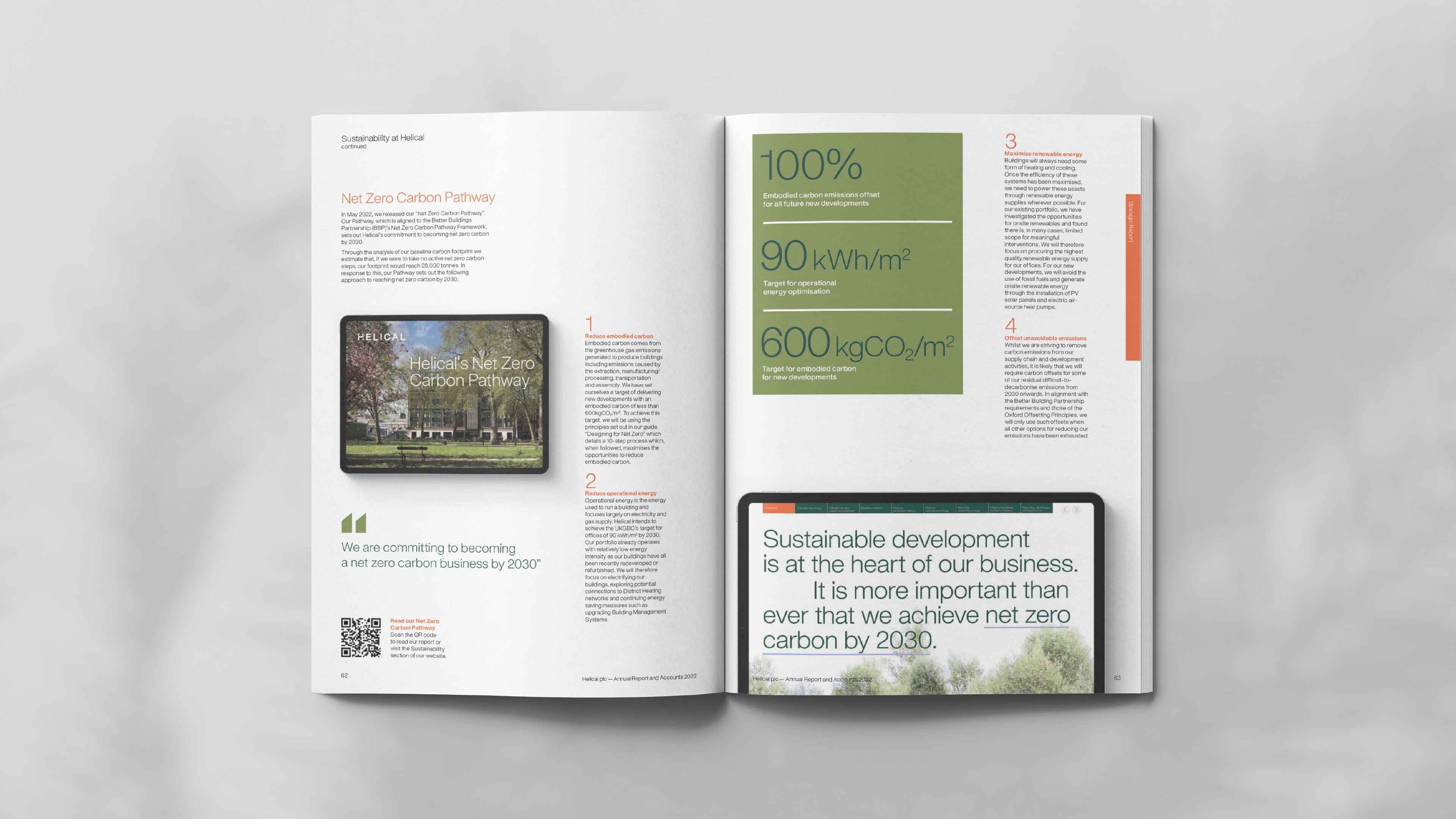
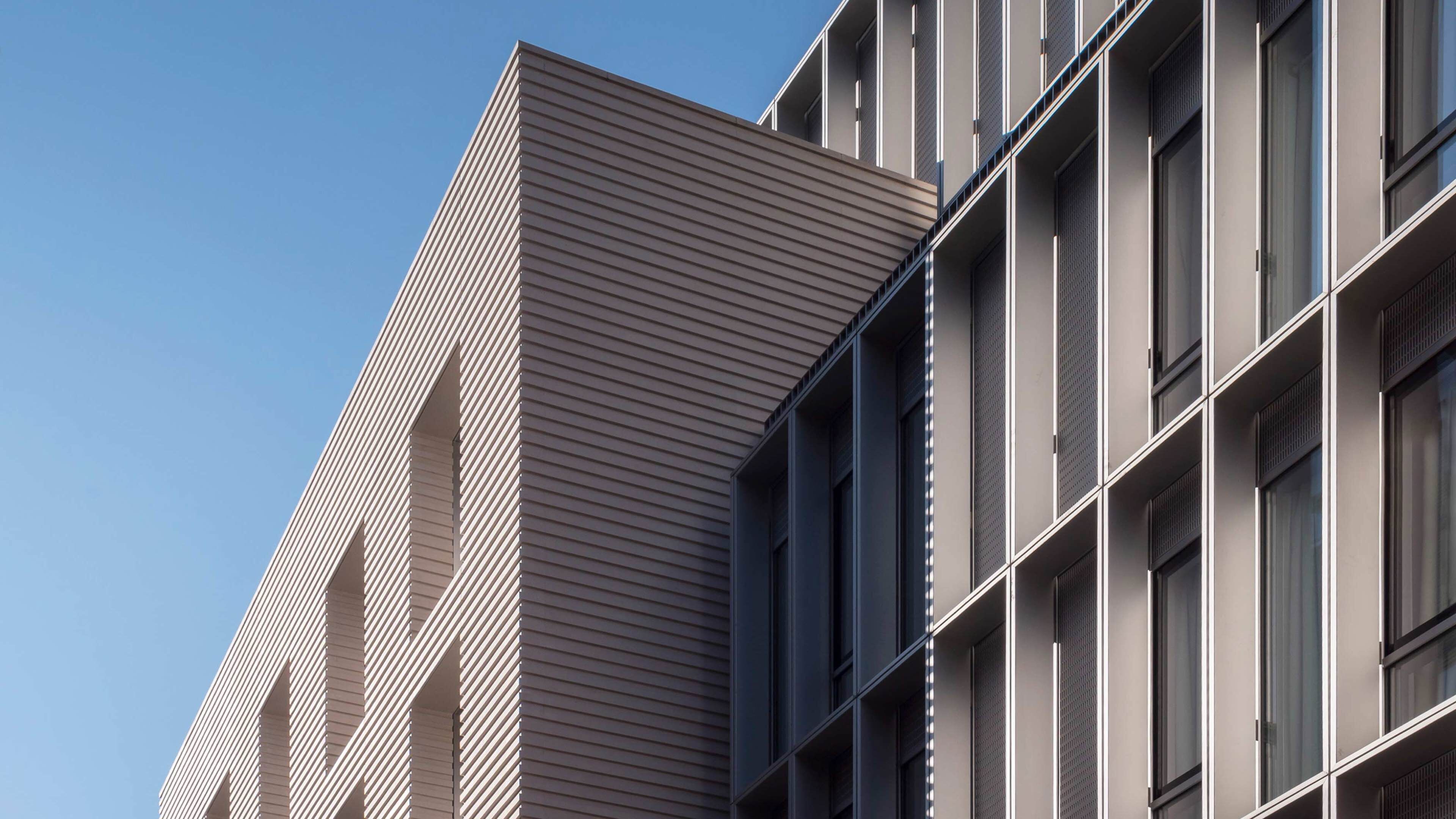
The new visual identity retains a link to the heritage and equity of the old brand but delivers a more impactful, confident and contemporary identity that can work at scale from development hoardings to small-scale digital applications and moving image.
Distinctive details
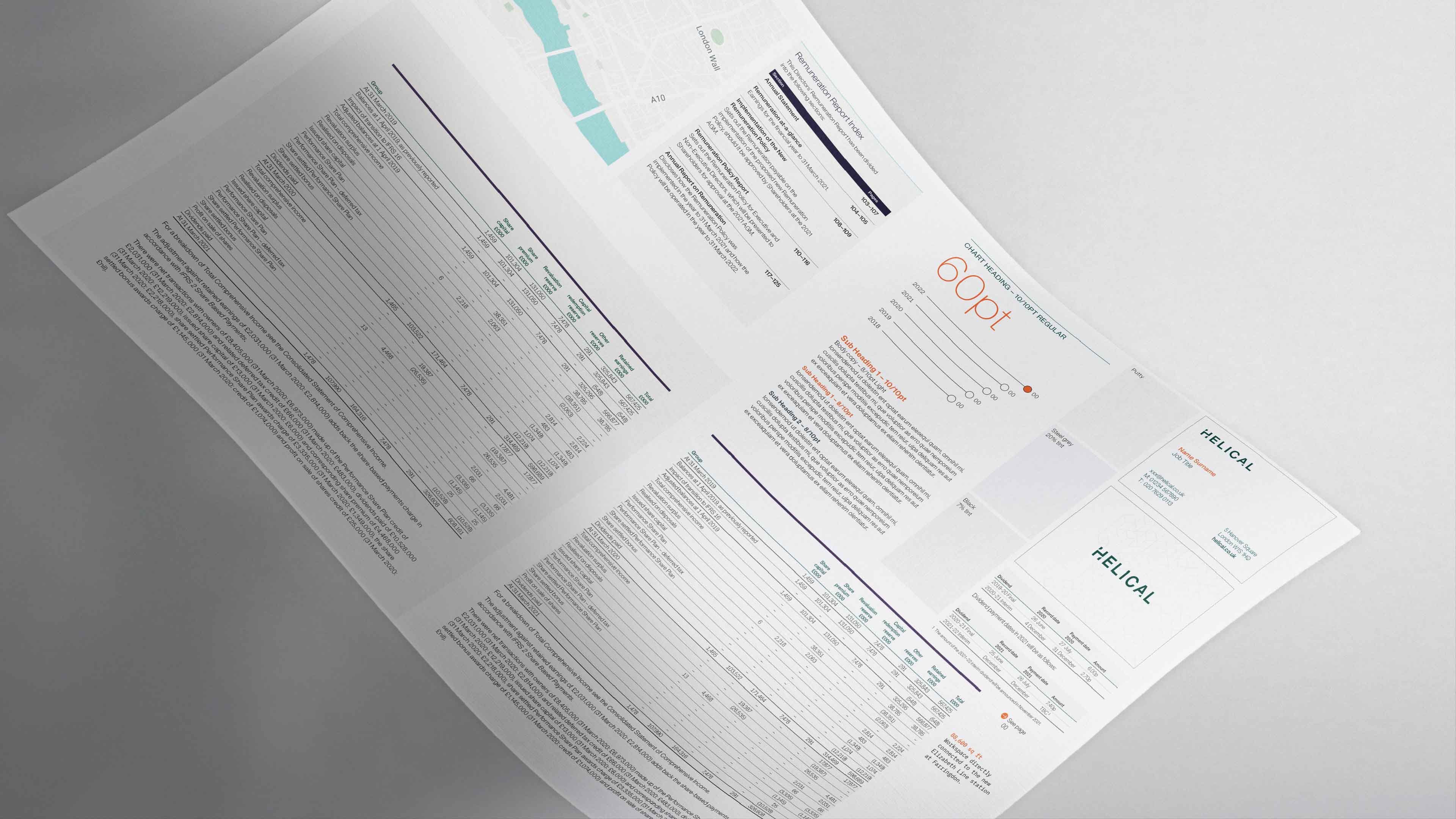
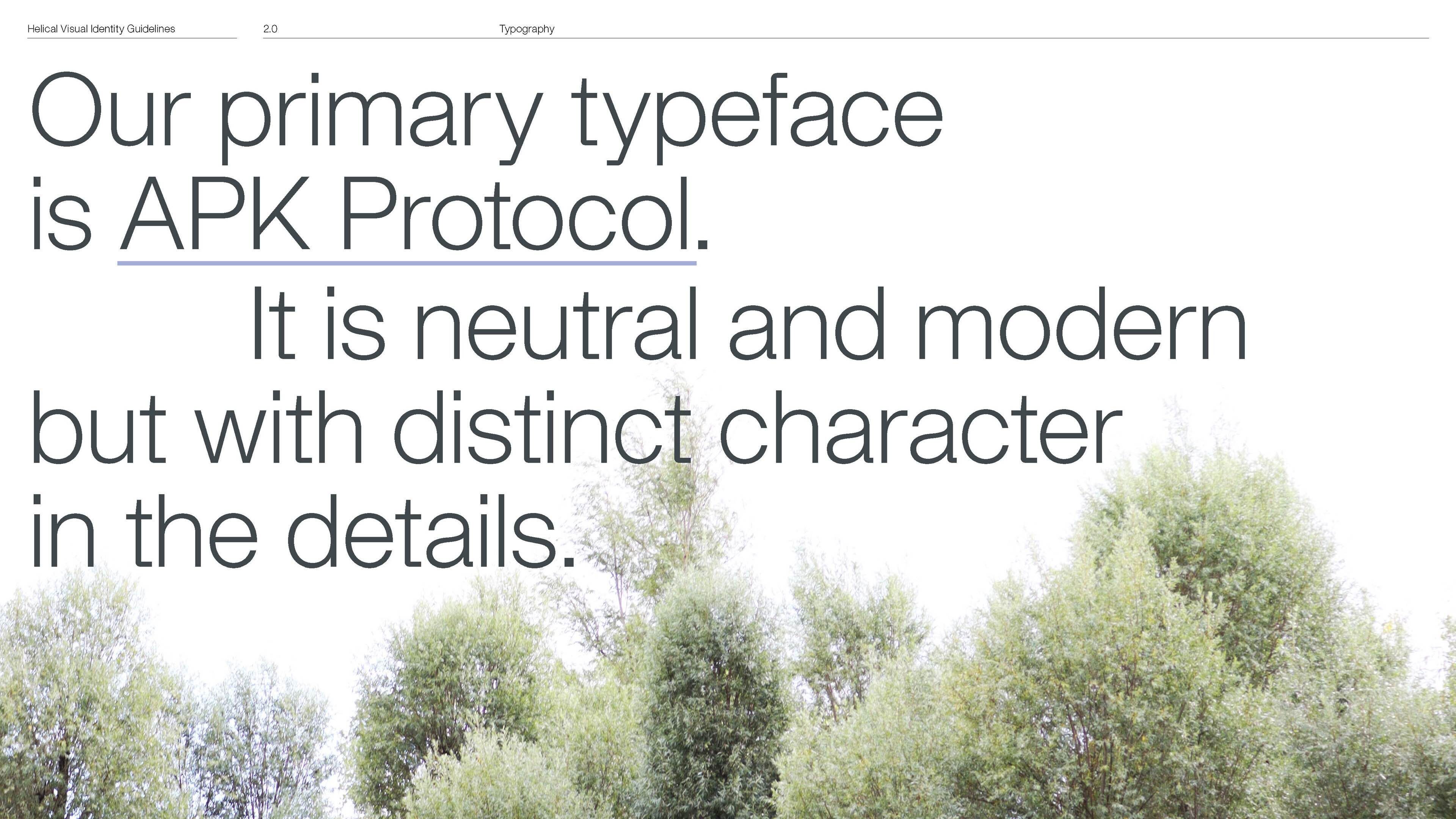
Typographically, the primary typeface APK Protocol is distinct, beautifully crafted and highly legible across both digital and print applications.
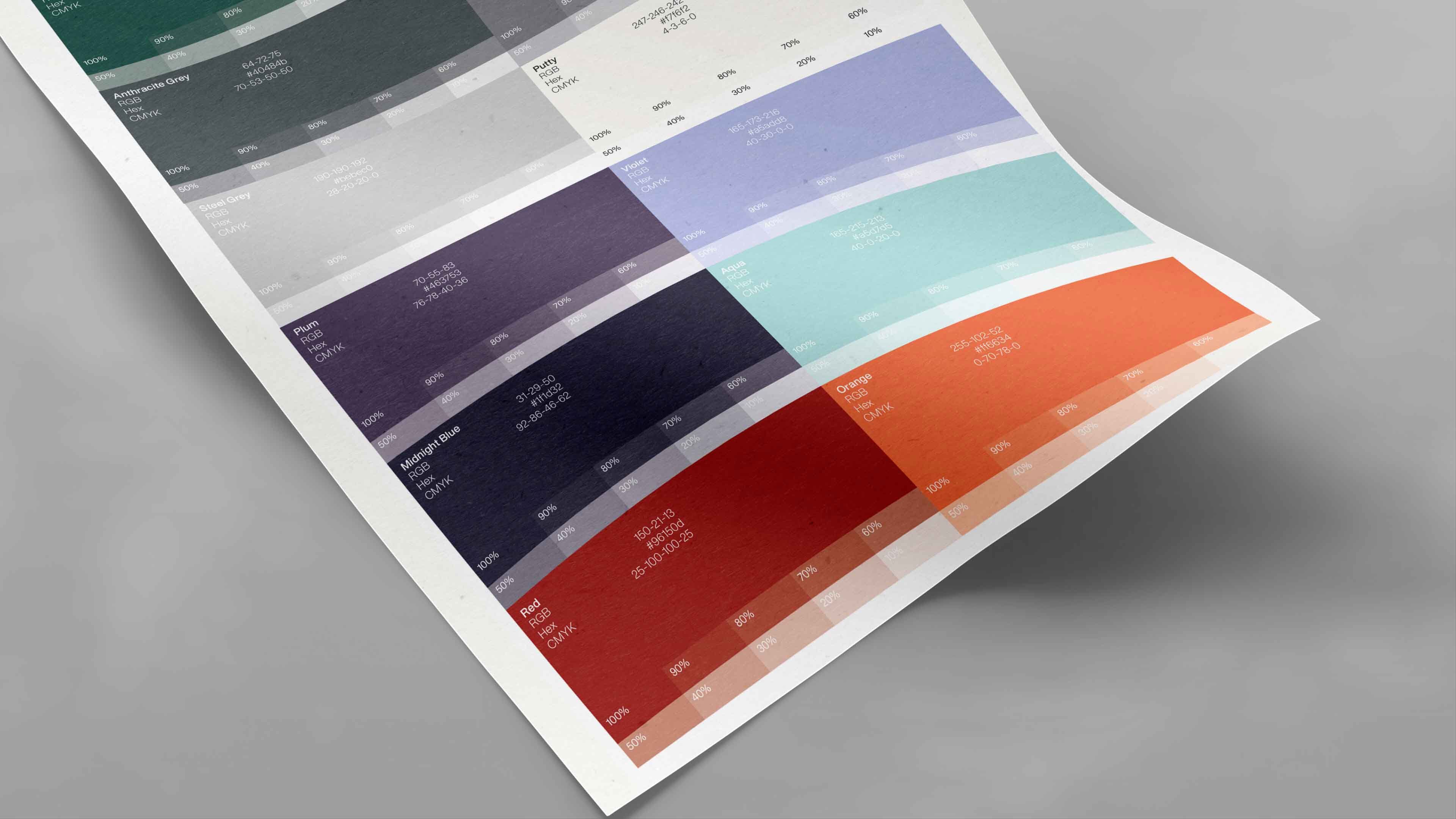
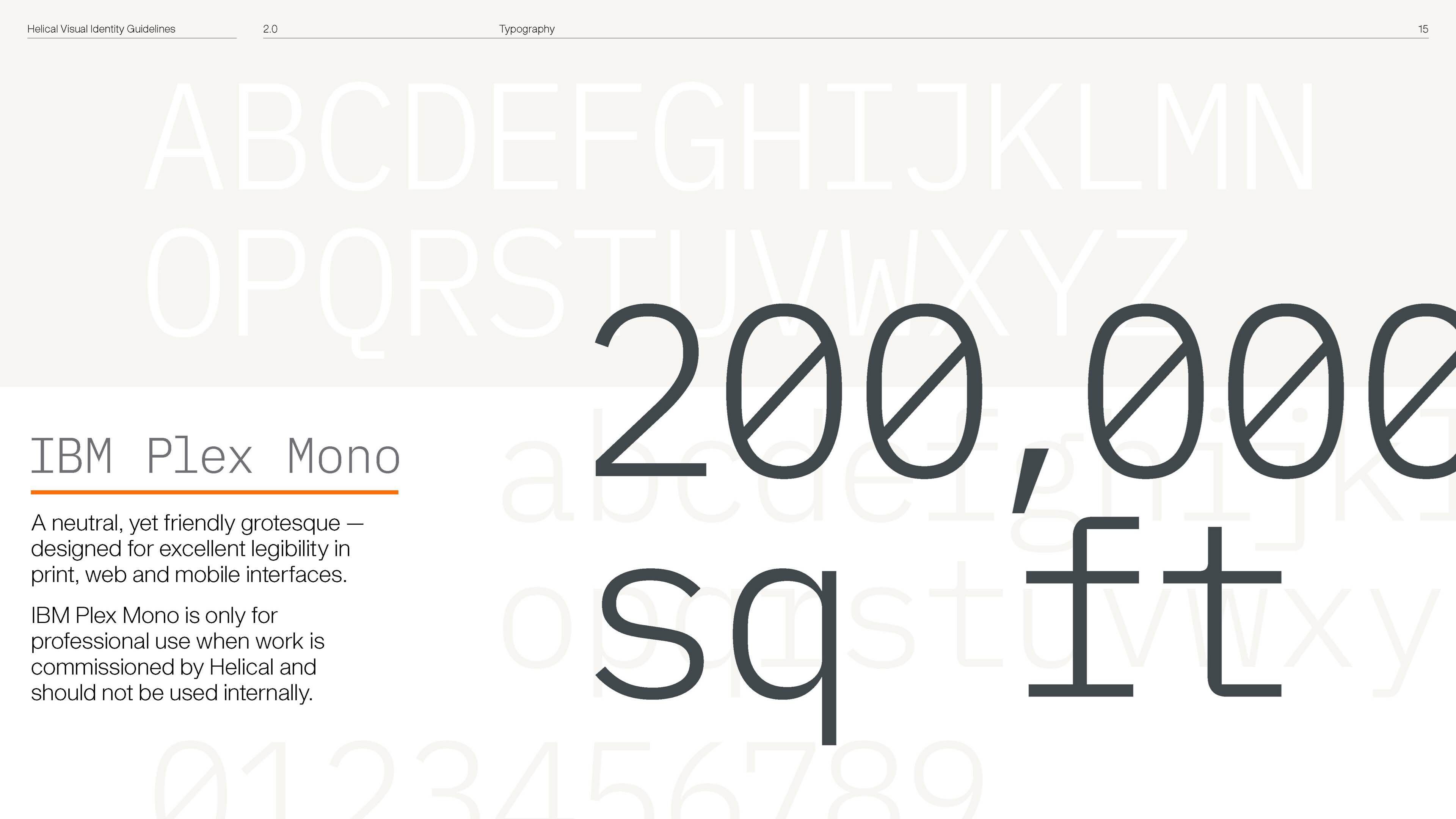
IBM Plex Mono provides a fresh supporting secondary typeface which, alongside APK Protocol, provides a contemporary suite of fonts that align with Helical's approach to the distinctive architectural detail it applies to its own developments. The colour palette uses neutrals to support traditional deep shades alongside a pop of brighter colours.
Using an abstraction of the visual identity, a graphic language was also created as a distinct brand element to be used as either a subtle pattern or dynamically cropped for a more contemporary application.
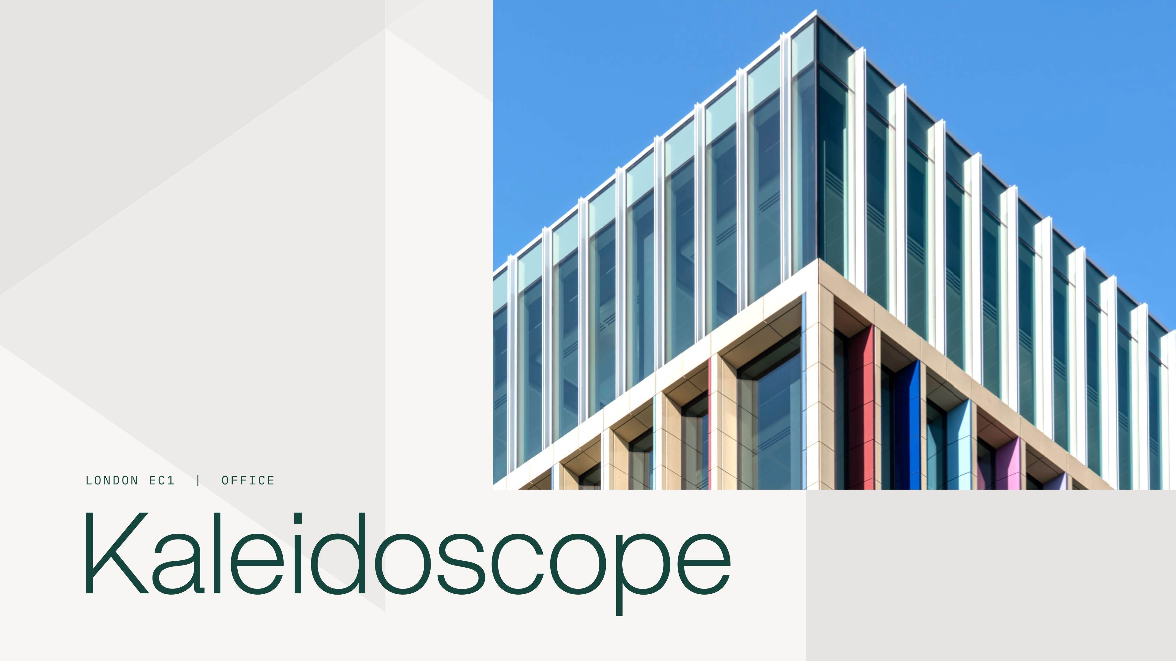
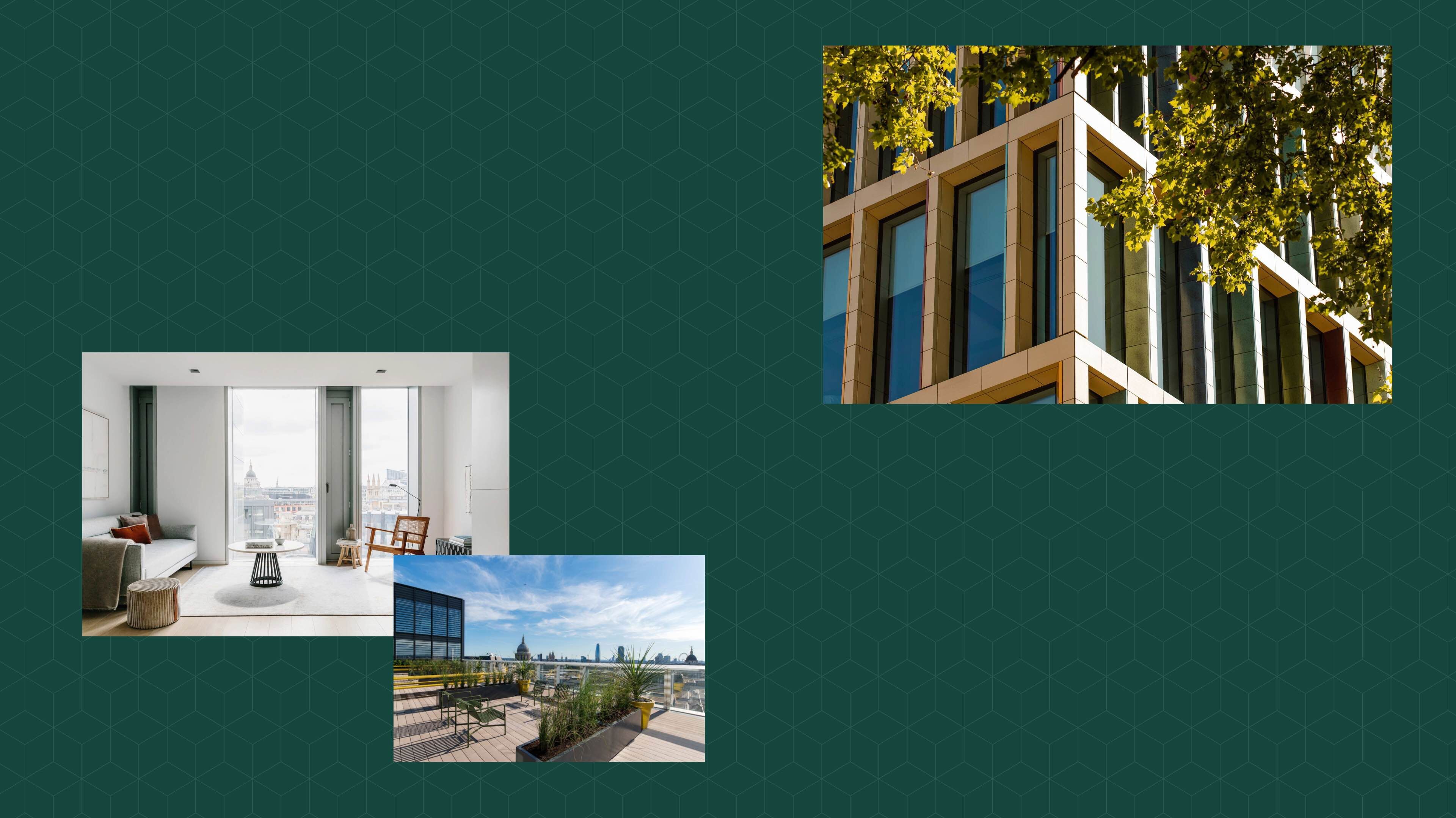



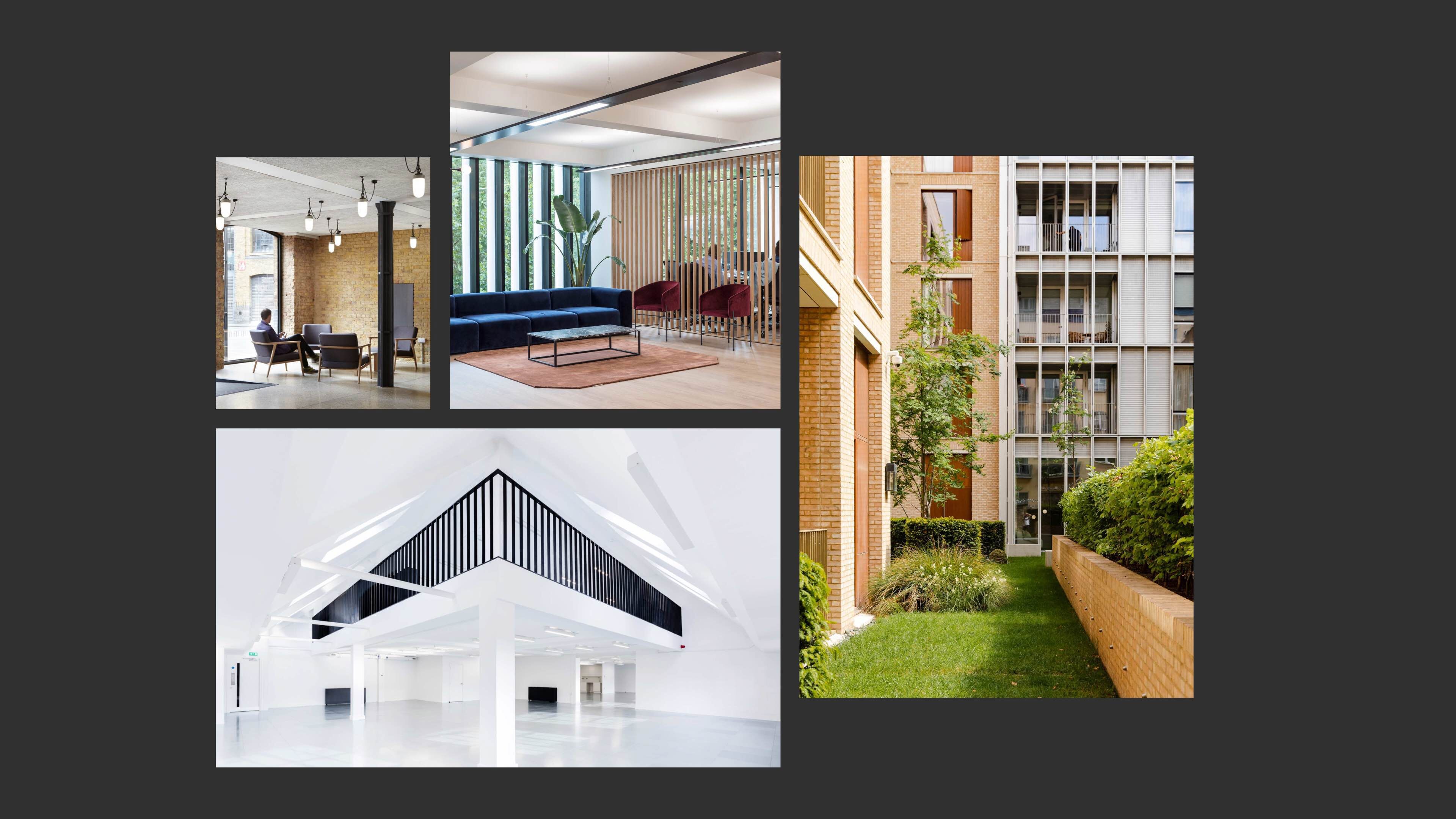
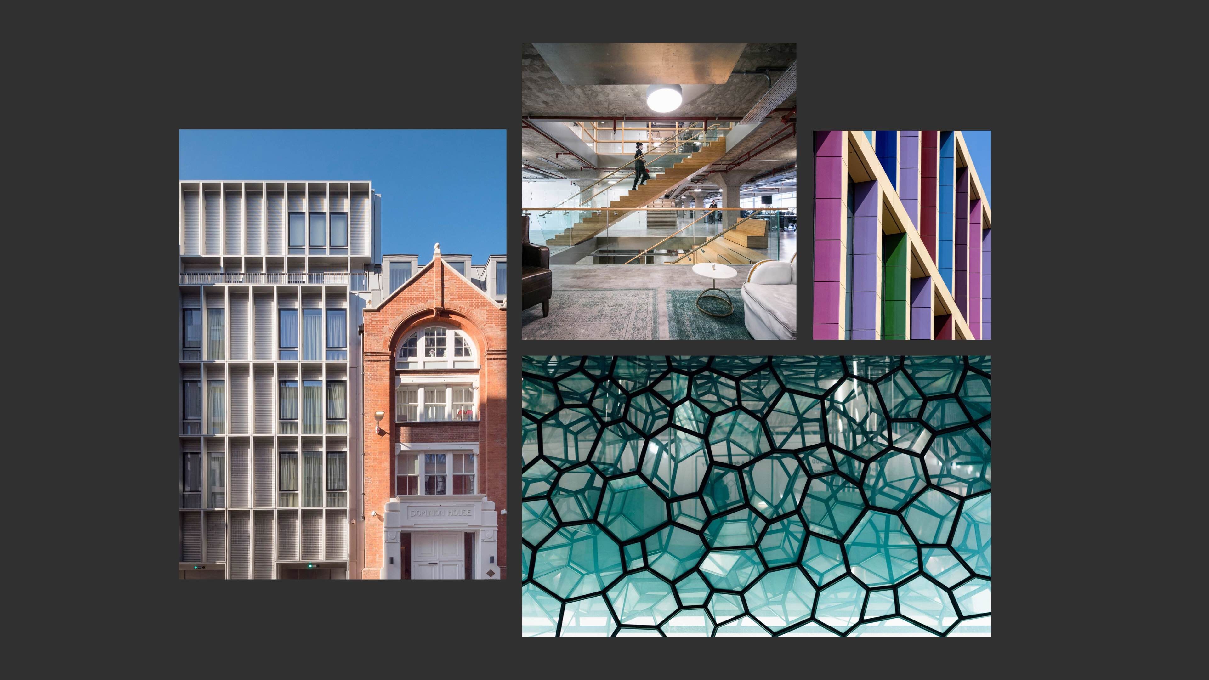
Introducing the new brand
Following an initial discovery stage, we designed and built the new site as a proactive piece of digital communication, moving beyond the historic investor focussed audience to include a much broader range of stakeholders from talent and local communities to the discerning occupiers who demand inspiring, beautiful, sustainable and flexible space with market-leading amenities.